After this date, you can continue to use Paste. Our documentation will remain available in the GitHub project.
Spacing and Layout
Spacing is the negative area between elements and components. Layouts use spacing to establish harmony, balance, and hierarchy.
Spacing is the negative area between elements and components. Layouts use spacing to establish harmony, balance, and hierarchy. This hierarchy makes content digestible by guiding users through important information and actions.
We also express our product traits of clean, professional, and neighborly through our spacing and layout choices.
- Helps make content easier for users to consume and visually signals that this is going to be an easy experience
- Establishes a hierarchy of information that relays important actions and information to the user
- Creates consistency throughout Twilio product suite
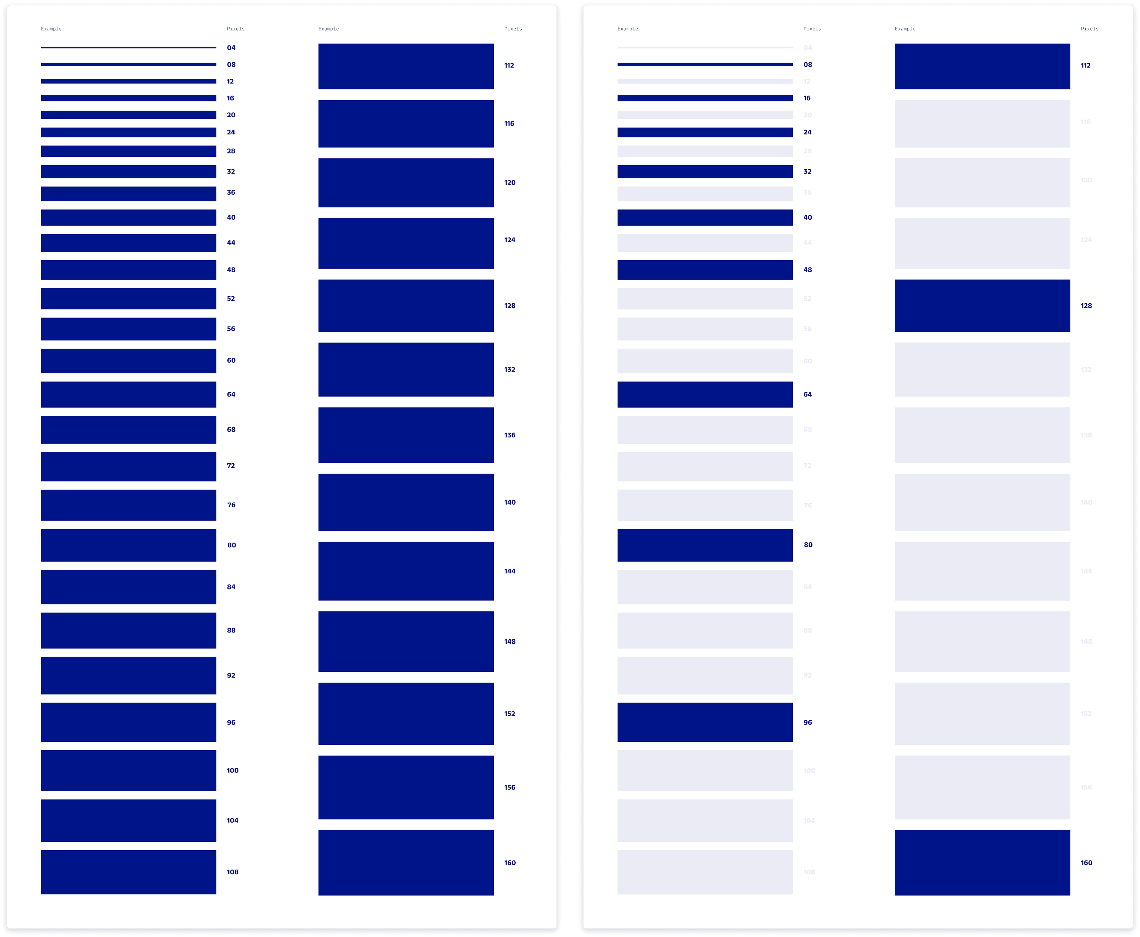
To create a stronger design point of view, and make consistency with spacing easier, we've opted to use an 8-pixel UI grid, paired with a 4-pixel baseline grid. The spacing options between elements should be multiples of 8 (8, 16, 24, 32, 40, 48, 64, 80, 96, 112, 128, 160). However, multiples of 4 are available if you require more flexibility and granularity in your designs.
Callout: UI grid vs. Grid component
When we refer to a grid in these guidelines, we aren't referring to our Grid component. These spacing foundations aren't yet baked into our more generic Grid component.
The advantage of working in an 8-pixel grid is there are fewer numbers to work with than a 4-pixel grid, making it easier to be consistent. By focusing on fewer, but more purposeful, spacing options, it makes it faster for us to get to better decisions.
Giving more spacing between elements can help reduce cognitive load for customers. By providing more breathing room for the content, it allows them to understand the most important actions and information that are required of them, and digest the information being presented. It also provides our users with visual cues that say, “Hey, we’re here to guide on what you can do next.”
Space can also be used to build visual relationships between the elements of your designs. Use negative space to create meaning by giving purposeful distances between groups of content.
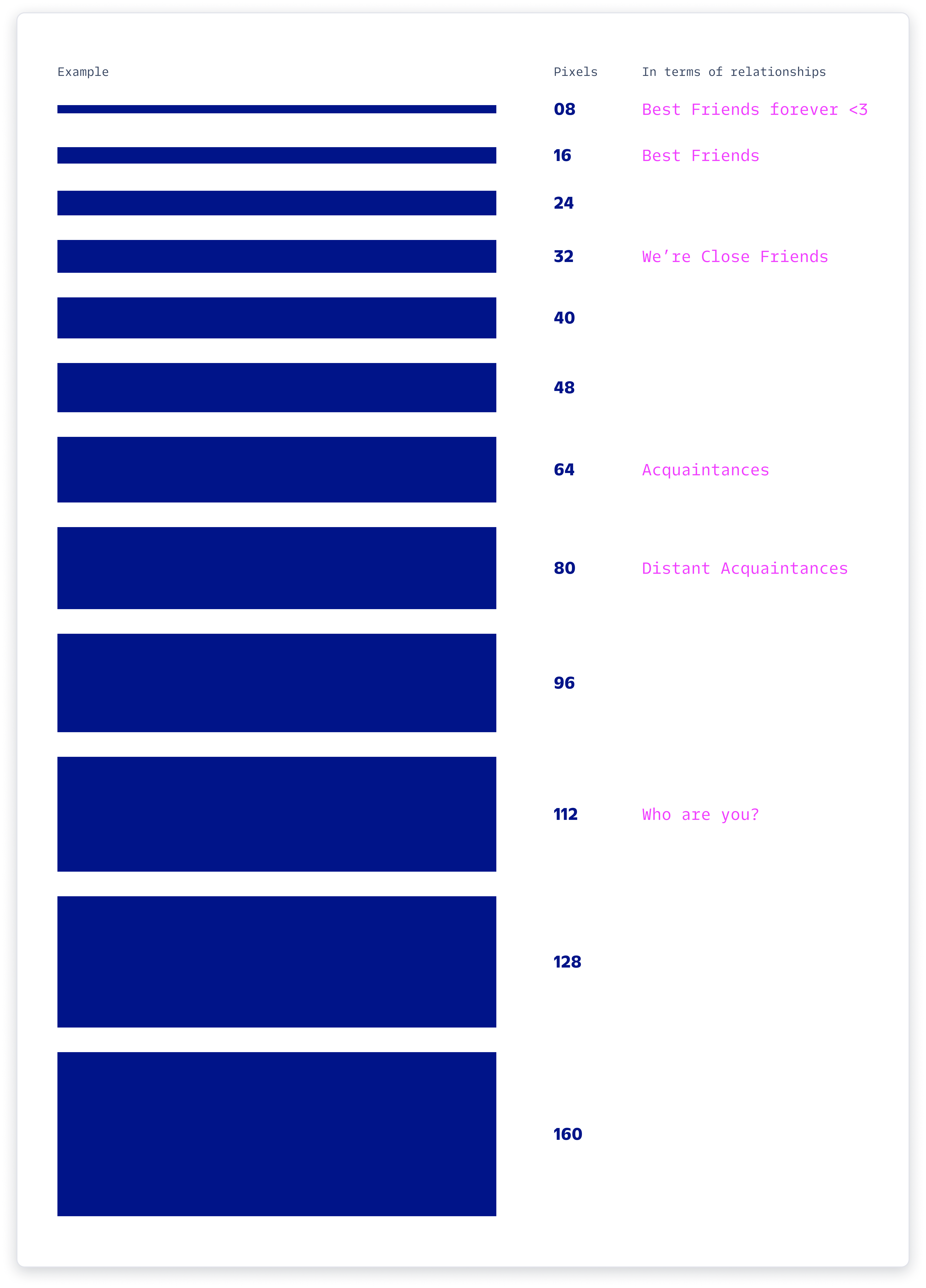
A spacing system draws on a “friendship” analogy. Some elements of a design should be in a closer relationship than others. The more familiar the two elements are, the closer they are to each other visually, and vice versa.
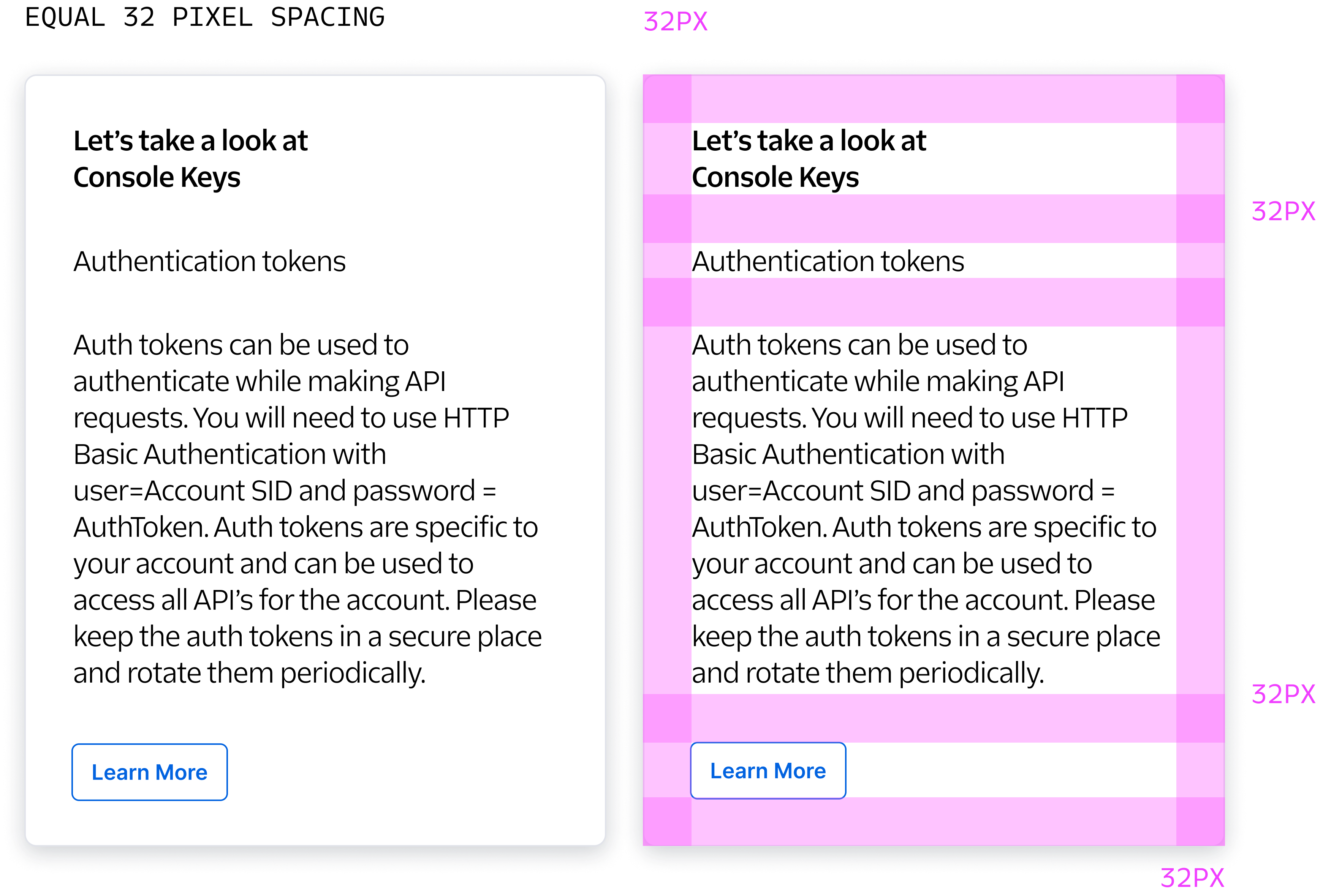
Now, let’s look at a visual demonstrating explaining spacing relationships:
In this visual, you see the same spacing of 32 pixels between the heading, subheading, paragraph, and primary action.
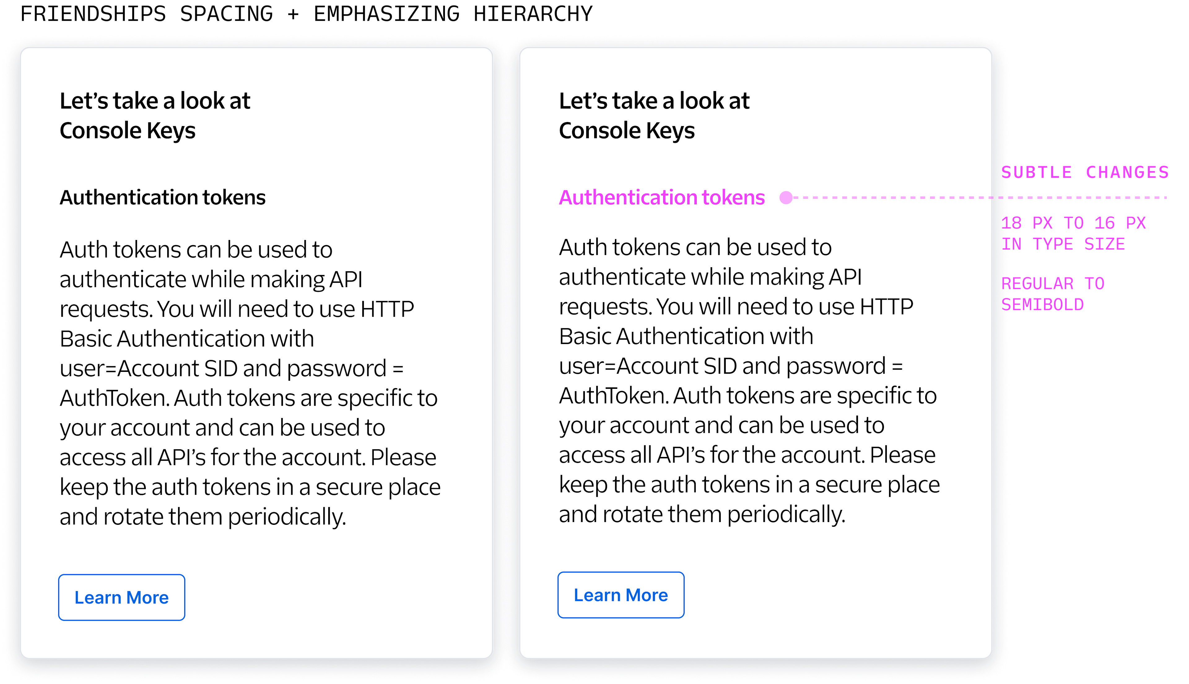
When there is equal spacing all-around, it’s unclear what purpose the subheading (“Authentication tokens”) serves, potentially making it look like it made its way into the layout by mistake.
Now imagine if we were to implement friendship spacing to this same example:
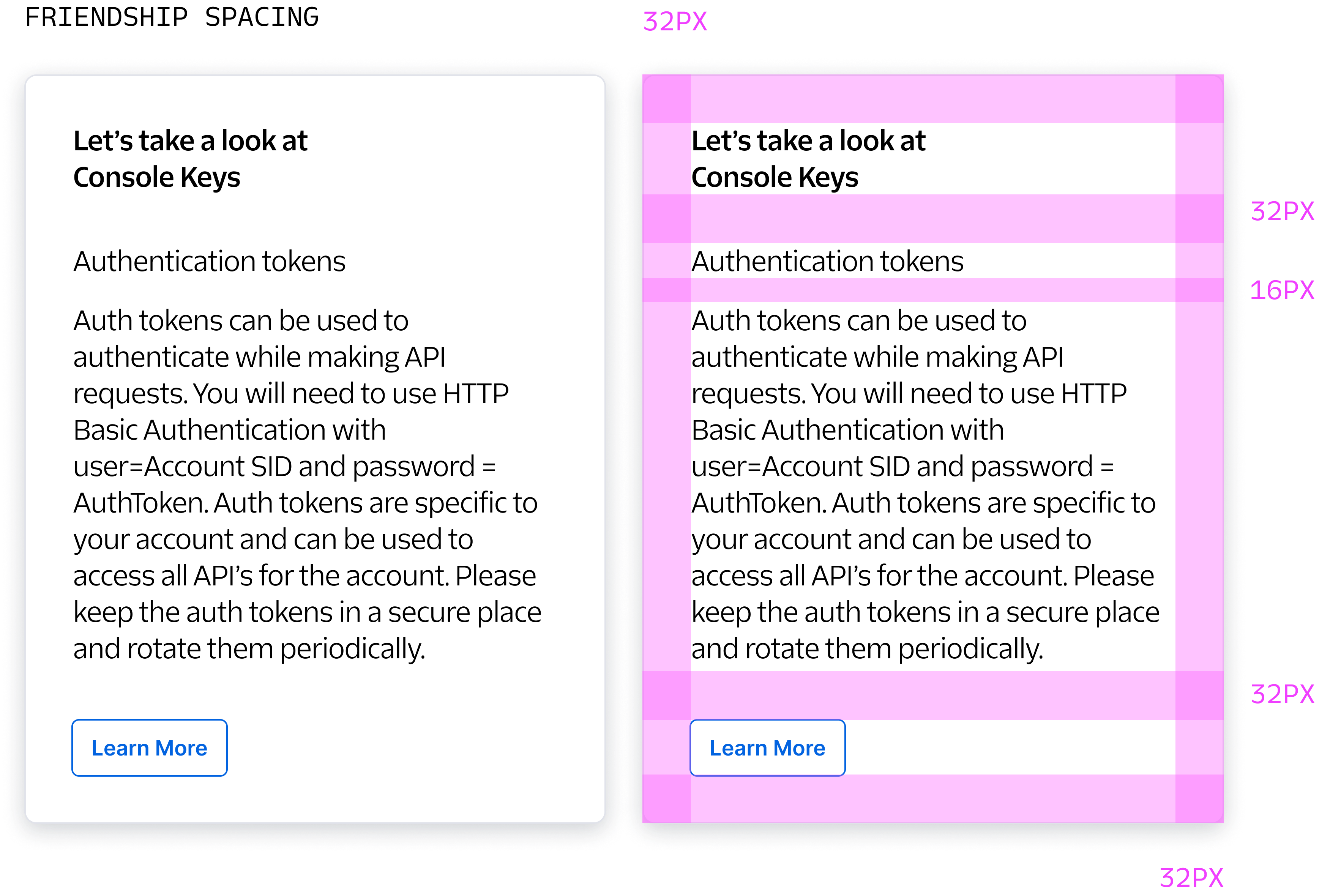
In the above example, we are creating a closer friendship between the subheading and paragraph. The heading and call-to-action are able to have breathing room, helping them stand out, so it's clear to the user what content they can expect in this section and what action they need to take.
Now let's take a look at if we were to use the same above example but put a sprinkle of styling to add hierarchy:
As you can see in the previous example, using friendship spacing can make it easier to stylize and create emphasis on important elements in your design once the spacing is established. 😋
Now that we established tighter containers with the friendship spacing, you can imagine laying out a page would be a lot easier.
Here is an example of friendship spacing applied within groups of content vertically:
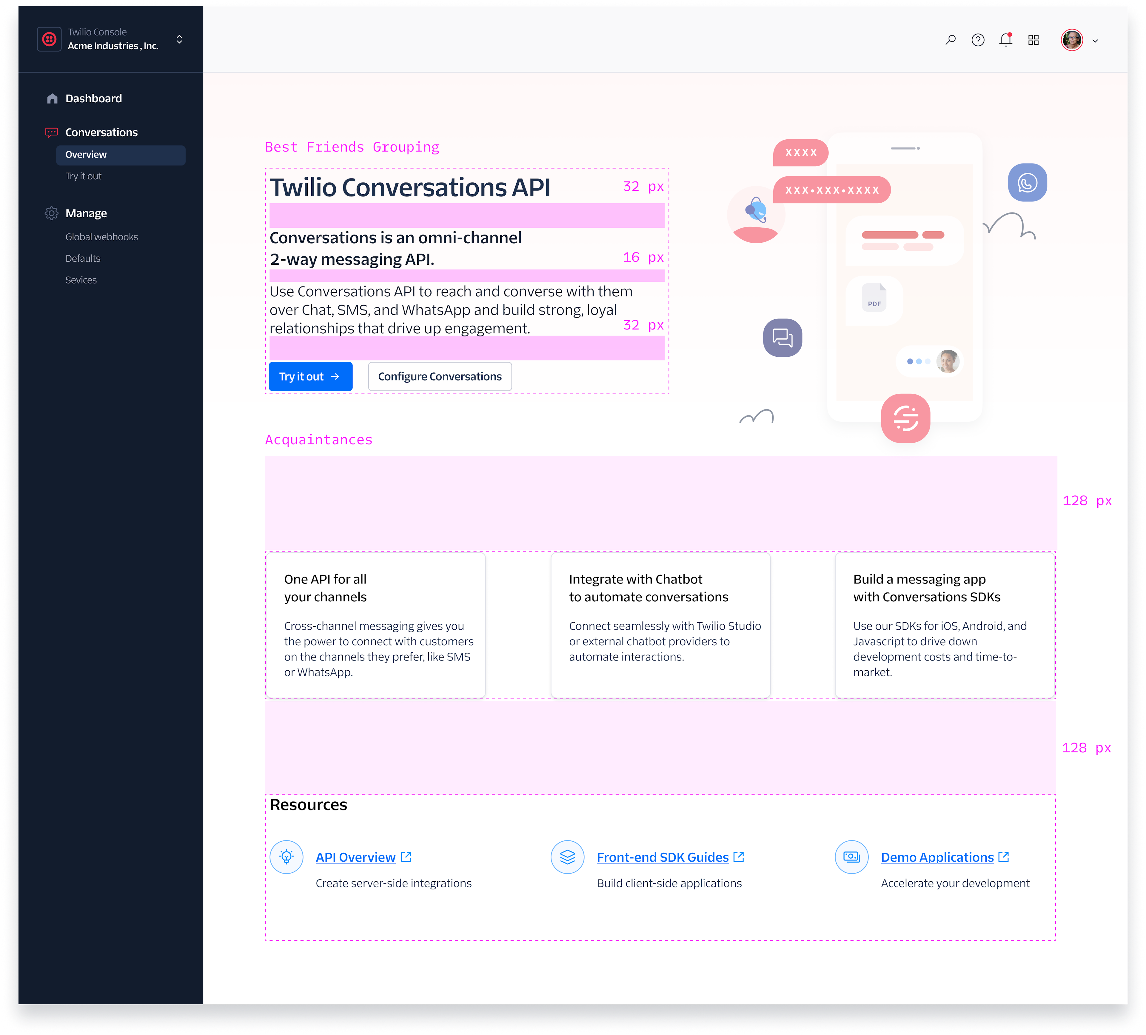
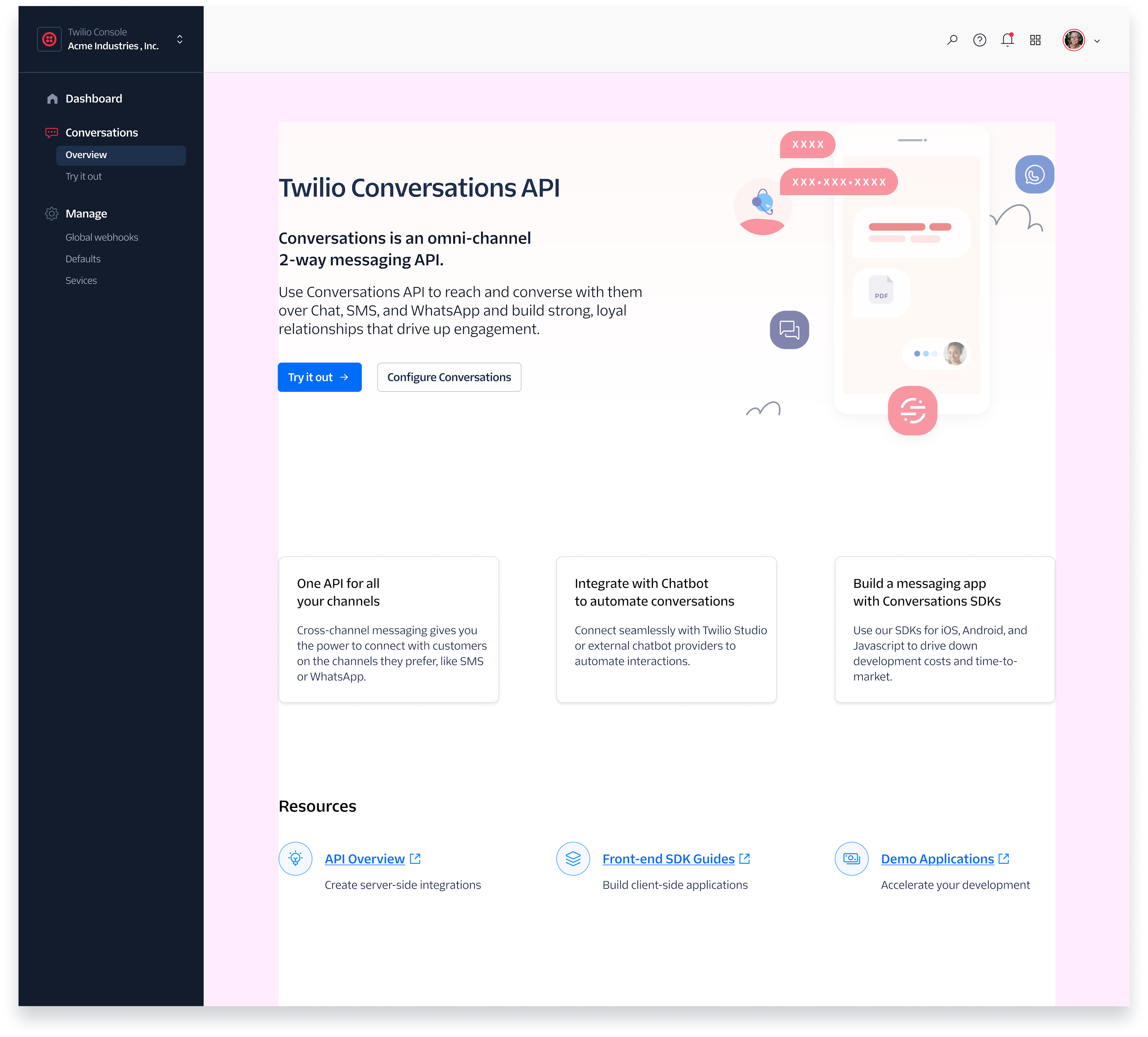
Once you have vertical friendship spacing applied, you can continue that logic for the rest of the page.
When it comes to vertical spacing, we want to make sure our elements are snapping to our margins. In this example, our top margin is 64 pixels and the left and right margins are 96 pixels. Ultimately, use margins that are multiples of 8.
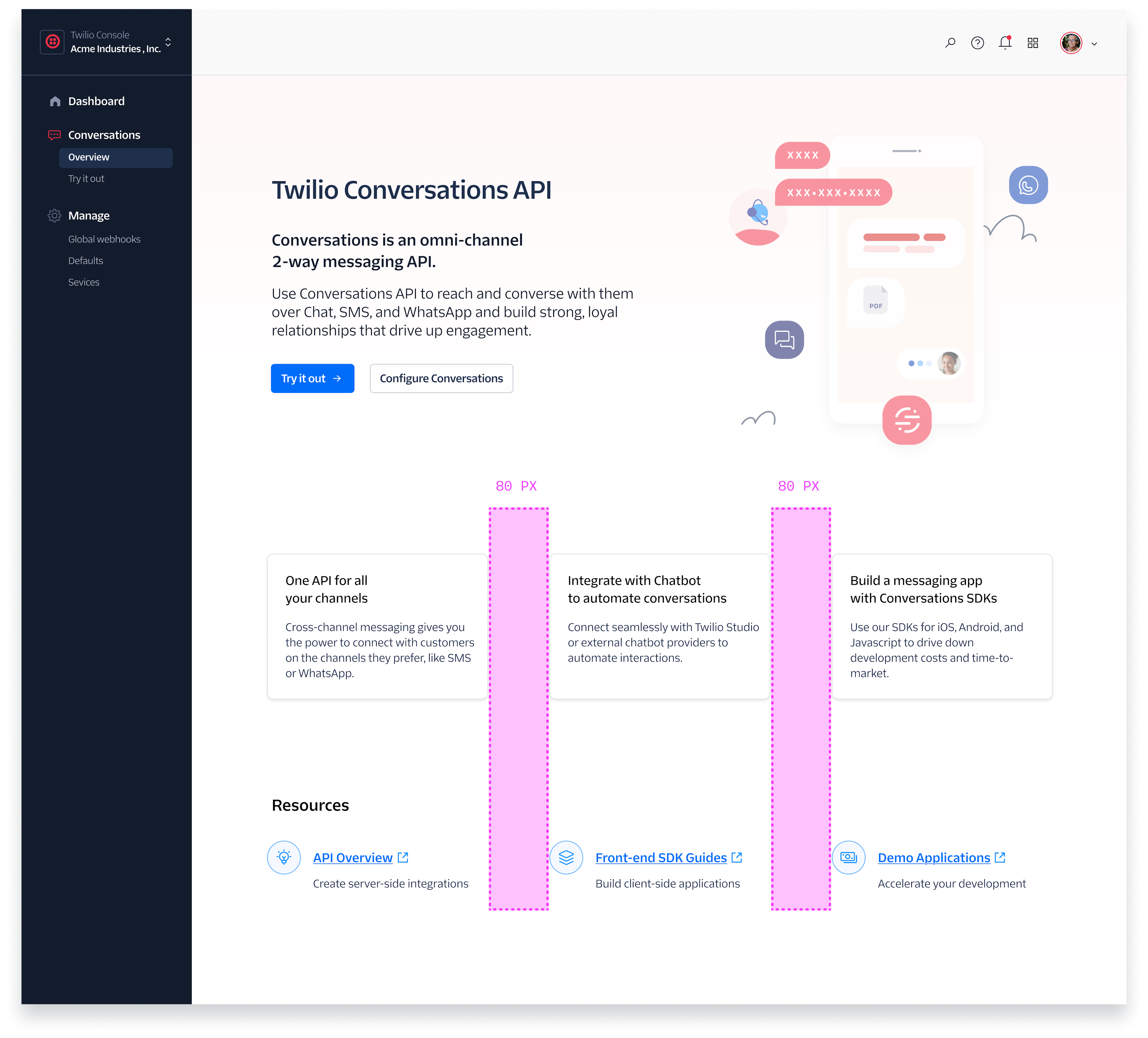
Horizontal spacing is very similar to vertical space, using 8-pixel multiples. Related objects or content should use the friendship method. However, horizontal spacing generally uses more spacing than vertical to visually break up section types. If using consistent horizontal spacing for sections correctly, your design becomes balanced and users don’t have to sift through lengthy content.
We suggest a max width of 1232px or size-120 for the content area (not including margins).
What responsive breakpoints do I use for my feature?
While this is heavily dependent on the Twilio product where your feature is built and whether its navigation frame supports responsive views, Paste currently has built-in breakpoints of 25rem (400px), 64rem (1024px), and 77rem (1232px).
Your text width should not be as long as your max width (1232px or size-120). In fact, a good rule of thumb for your text widths is no more than 65 characters per line. For Twilio default body text, we aim for about 712 pixels (size-70) for text width.
It's sometimes helpful to also break up content by pairing it with a hero image. By doing this, you're visually signaling that this is an effortless conversation.
By simply improving the spacing in your design, you will create a far more organized, clean, and cohesive layout.
- What information is related? Use 4 to 16 px spacing for related content.
- What critical actions does the user need to take? Use 16 to 32 px spacing between the actions and their related content.
- Are most of my horizontal margins and paddings in increments of 8?
- The final question you can ask yourself: Are these elements friends?!
Reference: UI cheat sheet: Spacing friendships