The Date Picker is an input field which accepts a value in MM/DD/YYYY format.
Currently, the Date Picker is built on top of the HTML date picker, using an input field with type="date", which comes with some inherent limitations.
In order to release a functional and stable Date Picker for immediate use, we decided to work within these limitations with the intention of updating this package to a custom Date Picker in a future release. The current API was designed to avoid any breaking changes with future versions of the Date Picker.
It is used with the Label and Help Text components.
Because browsers' implementations of the native date picker vary, this component may not be fully accessible in all cases. Chrome/Edge, Safari and Firefox all support the Date Picker, but the user experience differs browser-to-browser. Some of those differences are outlined below:
Chrome/Edge
| 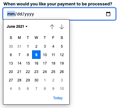 |
Safari
| 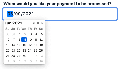 |
Firefox
| 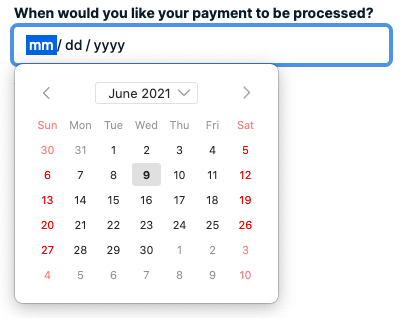 |
While cross-browser functionality, style and accessibility differences are present, they will not affect the usability of the Date Picker. The API is stable and full usage of the component is encouraged. There are certain use cases not included in the input type="date" functionality, such as a date range picker. You can find examples of how to recreate those use cases below. If there's a Date Picker use case not covered by the current implementation, feel free to open a Discussion so that we can help you find a solution.
- Include a visible label on all Date Pickers.
- Each label must use the
htmlForprop that matches theidof the associated input. - Use one of 3 ways to label a Date Picker:
- Visible label with Label (preferred)
- Visible label that's associated to the Date Picker with
aria-labelledby - Label directly using
aria-label
- Provide clear identification of required fields in the label or at the start of a form. If you use the required field indicator, include the form key at the start of the form.
- Use the
requiredprop to programatically indicate they are required to browsers.
- Use the
- Include inline error text with the error icon on any field that errors to make it visually clear that the field changed.
- If the Date Picker has associated help text or error text, include the
aria-describedbyprop on the Date Picker. This should match theidof the help or error text.
The Date Picker component should include the base DatePicker, along with supporting elements to compose an input field that gives users the context they need to successfully fill it out.
- Label — A label should be included for every Date Picker and provide a short title for its associated input.
- Required field indicator — In a form where there are fewer or as many required fields as optional, use a required indicator to show users which fields are required to be filled out.
- Help text — Text that's placed below the field to help users prevent an error and describe what makes the Date Picker input successful.
Make sure to connect the Label to the DatePicker. This is done with the htmlFor prop on the label, and the id prop on the Date Picker. Those two need to match.
If the Date Picker has any associated help text, it should also use the aria-describedby prop that equals the id of the help text. This ensures screen readers know the help text ties directly to the Date Picker.
The Date Picker doesn't currently support the selection of date ranges within a single input field, however a date range picker can be easily implemented using two side-by-side Date Pickers. For further validation, use the value of the start Date Picker as the min for the end Date Picker.
Paste pickers don't currently support date time range selections in a single component, however the same functionality can be implemented using a combobox along with the date range and time range picker solutions. If you'd like to provide your users with pre-determined options before displaying the pickers, use the following example as a jumping off point.
In addition to the Date Picker, this package exports a formatReturnDate() function that can be used to format the date value that's being returned from the Date Picker.
value, however, is always returned in yyyy-mm-dd format.To change the format of the return date value, we recommend using the formatReturnDate() function on the Date Picker's onChange() or onBlur() handler.
The function accepts two parameters: (1) the date value that should be formatted (e.g. '2021-03-24'), and (2) the desired date format (e.g. 'MM dd yyyy'). It uses a library called date-fns to return the given date in the desired format. Date format must follow the tokens outlined by date-fns.
Change a Date Picker to its error state and use Help Text to add an inline error if the value entered doesn't pass validation requirements.
Use Help Text to place an inline error is placed below the field to inform a user of any errors in their value. If help text exists, the error text should replace and repeat the help text.
Use a disabled Date Picker to show users that they can't interact with it.
If you want to show information that can't be edited, use a read-only field or consider another way of showing static information.
Use a read-only Date Picker when a its value can't be changed, but users should be able to read or apply focus on it.
A Date Picker must have at least a label and an input.
Quick note about Date Picker DOM methods
There are three methods that come with the HTML picker: stepUp(), stepDown() and select(). Usage of these methods is possible, but we do not encourage it, as they may not be supported in future versions of the Date Picker. Use at your own risk!
When using multiple Date Pickers, stack them vertically with $space-80 spacing between each field. To stack them, you can use either a Box or a Stack (as seen in the example below).
Avoid placing multiple pickers on the same horizontal row to help make it easier to scan a page vertically. Use a Grid if you need to place them horizontally.
Labels should clearly describe the date value being requested. They should be concise and descriptive, not instructional. To do this:
- Use help text to provide instruction if needed. For example, don't use "Enter the date you wish to receive your bill below" as label text. Instead, use "Billing date" as a label and "Your account will be automatically billed on the above date." as help text.
- Avoid articles ("a", "the") and punctuation. For example, use "SIM registration code" rather than "The SIM registration code".
To support internationalization, avoid starting a sentence with the label and using the field to finish it since sentence structures vary across languages. For example, use "Call log expiration date" or "How long should logs be stored?". Don't use "Remove logs after:".
Use required indicators to show users which fields they must fill out.
Validate Date Picker fields on form submission.
Validating a field input when the user leaves the current field (on blur) can be helpful to check for syntax errors. However, this can be frustrating to users who tab through controls to navigate a page, and to screen reader users, who might not be able to detect that an error occurred on blur.
Don't prevent form submission by disabling the submit button. A disabled button cannot be detected by assistive technologies. Use error messages to explain what information is missing or incorrect.
Usage of the min and max properties on Date Picker is encouraged if certain dates are invalid.
Use Help Text to show inline error text that explains how to fix an error.
Help text should have enough information to help users prevent errors. If help text exists and you need to show an error, the error text should replace and repeat the help text until the error has been resolved.
For additional guidance on how to compose error messages, refer to the error state pattern.
Date Picker and placeHolder
Because Date Picker has a default display value of mm/dd/yyyy (and defaults to the current date on Safari), any value that gets passed into placeholder will be overwritten (and effectively ignored).