Skip to contentSkip to navigationSkip to topbar
Paste assistant Assistant
Figma
Star

Page Header

Version 1.0.0GithubStorybook

Page Header is a layout component that wraps all top-level components on a page.

Component preview theme
const PageHeaderExample = () => {
return (
<PageHeader size="default">
<PageHeaderSetting>
<Breadcrumb>
<BreadcrumbItem href="#">Manage billing</BreadcrumbItem>
</Breadcrumb>
</PageHeaderSetting>
<PageHeaderDetails>
<PageHeaderKeyword>
<Badge as="span" variant="new">
<NewIcon decorative />
Beta
</Badge>
</PageHeaderKeyword>
<PageHeaderHeading>Subscriptions</PageHeaderHeading>
<PageHeaderActions>
<ButtonGroup>
<Button variant="primary">Add a subscription <ArrowForwardIcon decorative /></Button>
</ButtonGroup>
</PageHeaderActions>
<PageHeaderParagraph>Manage your subscriptions here. Costs listed here may exclude taxes, fees, support fees, expert services costs, and certain other products.</PageHeaderParagraph>
</PageHeaderDetails>
<PageHeaderInPageNavigation>
<InPageNavigation aria-label="get started">
<InPageNavigationItem href="#" currentPage>
Subscriptions
</InPageNavigationItem>
<InPageNavigationItem href="#">Recurring items</InPageNavigationItem>
</InPageNavigation>
</PageHeaderInPageNavigation>
</PageHeader>
);
};
render(
<PageHeaderExample />
)

Guidelines

Guidelines page anchor

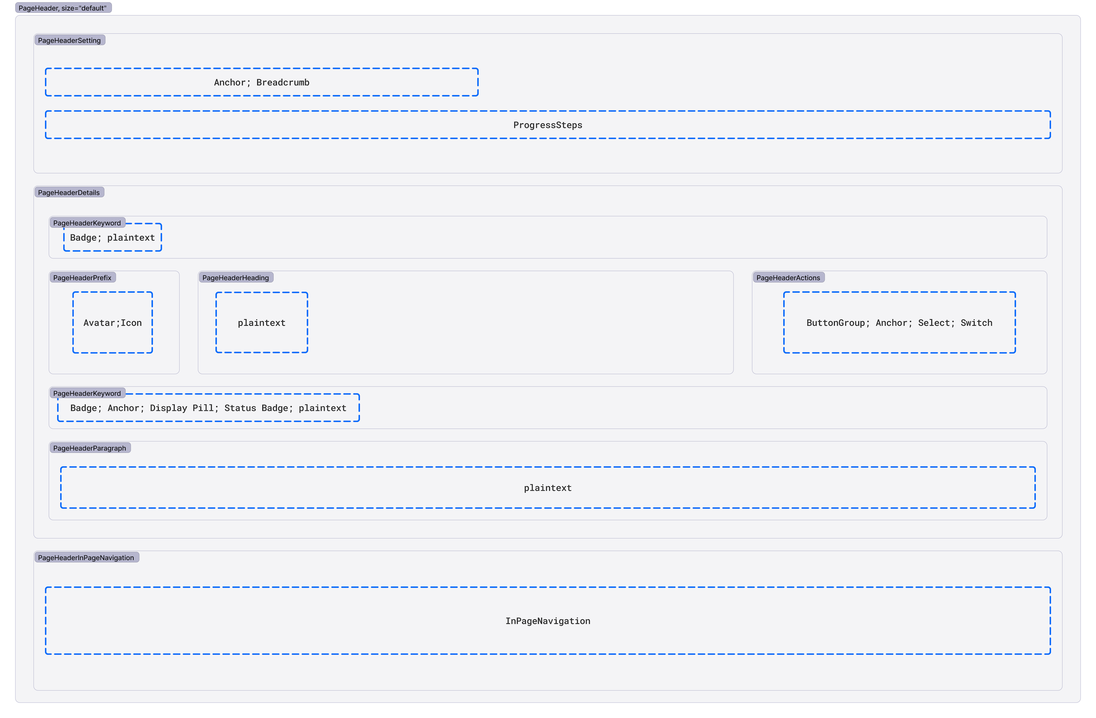
Page Header controls the spacing and layout for any potential components used above the main content of the page. Components that may be a part of the Page Header include Breadcrumb, Progress Steps, Heading, and Button Group, among others.

There are 3 sections that make up the Page Header component, though you won’t always use all 3 at the same time.

  1. PageHeaderSetting contains any components that relate to the positioning of the current page in relation to parent or sibling pages, including navigating between those pages. Context components may include:
  2. PageHeaderDetails is where all page-related information belongs. It includes static text and interactive components that relate to the page as a whole. Components that might live within the PageHeaderDetails include:
    • Detail Text (for example, the title of the entire wizard flow)
    • Heading (for example, the page title)
    • Badge (for example, “enabled”, “beta”, etc.)
    • Paragraph (for example, additional text below the title)
    • Button and Button Group (for example, “create”, “edit”, “cancel”, etc. buttons)
    • Anchor (for example, link to a related/useful page such as docs - not a parent page)
    • Select
  3. PageHeaderInPageNavigation contains the In Page Navigation for the page content, if using.

Here’s what the component layout looks like with all its bits and pieces:

Visual representation of the Page Header API and design
(information)

Using Alerts with Page Headers

There are times when you’ll need to display an Alert at the top of a page to communicate an important message to the user. Alerts should not be children of the Page Header component. If the Alert communicates a platform-level message, place it above the Page Header. If the Alert communicates a page-level message, place it below the Page Header.

Much of the Paste Page Header component was inspired by the wonderful work of Github’s Primer Design system and their own Page Header(link takes you to an external page) API and documentation.

Accessibility

Accessibility page anchor

Page Header has no inherent accessibility concerns. However, there will likely be accessibility concerns related to the components used within Page Header. Recommended considerations include:

  • The accessibility considerations of the components used. Refer to each component’s documentation.
  • The order and visual or content hierarchy of the children passed to Page Header, and how they affect readability.
  • What you pass to the as property when using Headings. Headings that live at the top of the page and are the title of the page (most Page Headers fall under this category) should be h1s. Only use a heading level lower than h1 if the Page Header exists within a page that already has an h1 title (very few Page Headers fall under this category).

The Page Header can be composed to fit the needs of your page. Only include necessary components.

Default Page Headers should have space-130 clearspace above them. Place platform-level Alerts above this clearspace.

Component preview theme
const PageHeaderExample = () => {
return (
<PageHeader size="default">
<PageHeaderSetting>
<Breadcrumb>
<BreadcrumbItem href="#">Manage billing</BreadcrumbItem>
</Breadcrumb>
</PageHeaderSetting>
<PageHeaderDetails>
<PageHeaderKeyword>
<Badge as="span" variant="new">
<NewIcon decorative />
Beta
</Badge>
</PageHeaderKeyword>
<PageHeaderHeading>Subscriptions</PageHeaderHeading>
<PageHeaderActions>
<ButtonGroup>
<Button variant="primary">Add a subscription <ArrowForwardIcon decorative /></Button>
</ButtonGroup>
</PageHeaderActions>
<PageHeaderParagraph>Manage your subscriptions here. Costs listed here may exclude taxes, fees, support fees, expert services costs, and certain other products.</PageHeaderParagraph>
</PageHeaderDetails>
<PageHeaderInPageNavigation>
<InPageNavigation aria-label="get started">
<InPageNavigationItem href="#" currentPage>
Subscriptions
</InPageNavigationItem>
<InPageNavigationItem href="#">Recurring items</InPageNavigationItem>
</InPageNavigation>
</PageHeaderInPageNavigation>
</PageHeader>
);
};
render(
<PageHeaderExample />
)

Page Header in an interrupted flow

Page Header in an interrupted flow page anchor

When the user navigates to an unrelated page, such as a separate product’s marketing page, it might not make sense to use a Breadcrumb in the page header for navigation. Instead, use an Anchor with ArrowBackIcon and the text “Return to [previous page name]”.

Component preview theme
const PageHeaderExample = () => {
return (
<PageHeader size="default">
<PageHeaderSetting>
<Anchor href="#" display="inline-flex" alignItems="center"><ArrowBackIcon decorative />Return to Flex</Anchor>
</PageHeaderSetting>
<PageHeaderDetails>
<PageHeaderHeading>Getting started with Segment</PageHeaderHeading>
<PageHeaderMeta><Anchor href="#">Download the help guide PDF</Anchor></PageHeaderMeta>
</PageHeaderDetails>
</PageHeader>
);
};
render(
<PageHeaderExample />
)

Use the compact size of Page Header for narrow containers, such as a Chat Log within a Minimizable Dialog or a custom dialog. If the Page Header only applies to a small portion of the page, you may pass a non-h1 value to the as property.

Compact Page Headers should have at least space-50 clearspace above them. Be sure to use size small Buttons for Page Header Actions.

Component preview theme
const PageHeaderExample = () => {
return (
<Box maxWidth="size50" borderStyle="solid" padding="space50" borderWidth="borderWidth10" borderColor="colorBorderDecorative10Weaker" borderRadius="borderRadius20">
<PageHeader size="compact">
<PageHeaderDetails>
<PageHeaderPrefix><Avatar name="parker smith" size="sizeIcon100" icon={UserIcon} /></PageHeaderPrefix>
<PageHeaderHeading>Parker Smith</PageHeaderHeading>
<PageHeaderActions>
<ButtonGroup>
<Button variant="secondary" size="small">Edit</Button>
<Button variant="secondary" size="small"><MoreIcon decorative={false} title="more menu" /></Button>
</ButtonGroup>
</PageHeaderActions>
<PageHeaderMeta>
Customer since June 11, 2009
<StatusBadge variant="ConnectivityAvailable">
Online
</StatusBadge>
</PageHeaderMeta>
</PageHeaderDetails>
<PageHeaderInPageNavigation>
<InPageNavigation aria-label="get started">
<InPageNavigationItem href="#" currentPage>
Customer details
</InPageNavigationItem>
<InPageNavigationItem href="#">Customer history</InPageNavigationItem>
</InPageNavigation>
</PageHeaderInPageNavigation>
</PageHeader>
</Box>
);
};
render(
<PageHeaderExample />
)

Page Header on an object details page

Page Header on an object details page page anchor

See the object details page template documentation for more guidance.

Component preview theme
const PageHeaderExample = () => {
return (
<PageHeader size="default">
<PageHeaderSetting>
<Breadcrumb>
<BreadcrumbItem href="#">Voice</BreadcrumbItem>
<BreadcrumbItem href="#">Calls</BreadcrumbItem>
</Breadcrumb>
</PageHeaderSetting>
<PageHeaderDetails>
<PageHeaderHeading>Call details</PageHeaderHeading>
<PageHeaderActions>
<Button variant="secondary">Give call quality feedback</Button>
</PageHeaderActions>
</PageHeaderDetails>
<PageHeaderInPageNavigation>
<InPageNavigation aria-label="get started">
<InPageNavigationItem href="#" currentPage>
Overview
</InPageNavigationItem>
<InPageNavigationItem href="#">Insights summary</InPageNavigationItem>
</InPageNavigation>
</PageHeaderInPageNavigation>
</PageHeader>
);
};
render(
<PageHeaderExample />
)

Page Header on an objects list page

Page Header on an objects list page page anchor

See the objects list page template documentation for more guidance.

Component preview theme
const PageHeaderExample = () => {
return (
<PageHeader size="default">
<PageHeaderSetting>
<Breadcrumb>
<BreadcrumbItem href="#">Phone numbers</BreadcrumbItem>
<BreadcrumbItem href="#">Manage</BreadcrumbItem>
</Breadcrumb>
</PageHeaderSetting>
<PageHeaderDetails>
<PageHeaderHeading>Verified caller IDs</PageHeaderHeading>
<PageHeaderActions>
<Button variant="primary">Add caller ID</Button>
</PageHeaderActions>
<PageHeaderParagraph>Use numbers you own as caller ID or the "To" number for outbound calls and messages. Phone numbers you buy from Twilio or port to Twilio can always be used as caller IDs.</PageHeaderParagraph>
</PageHeaderDetails>
</PageHeader>
);
};
render(
<PageHeaderExample />
)

Page Header on a settings page

Page Header on a settings page page anchor

See the settings page template documentation for more guidance.

Component preview theme
const PageHeaderExample = () => {
return (
<PageHeader size="default">
<PageHeaderSetting>
<Breadcrumb>
<BreadcrumbItem href="#">Phone numbers</BreadcrumbItem>
<BreadcrumbItem href="#">Manage</BreadcrumbItem>
</Breadcrumb>
</PageHeaderSetting>
<PageHeaderDetails>
<PageHeaderHeading>Billing settings</PageHeaderHeading>
<PageHeaderParagraph>Use numbers you own as caller ID or the "To" number for outbound calls and messages. Phone numbers you buy from Twilio or port to Twilio can always be used as caller IDs.</PageHeaderParagraph>
</PageHeaderDetails>
<PageHeaderInPageNavigation>
<InPageNavigation aria-label="get started">
<InPageNavigationItem href="#" currentPage>
Invoicing
</InPageNavigationItem>
<InPageNavigationItem href="#">Service address</InPageNavigationItem>
<InPageNavigationItem href="#">Tax information</InPageNavigationItem>
</InPageNavigation>
</PageHeaderInPageNavigation>
</PageHeader>
);
};
render(
<PageHeaderExample />
)

Page Header on a wizard page

Page Header on a wizard page page anchor

Use the Progress Steps in the context wrapper when included as part of the wizard page template.

Component preview theme
const PageHeaderExample = () => {
return (
<PageHeader size="default">
<PageHeaderSetting>
<Breadcrumb>
<BreadcrumbItem href="#">Breadcrumb</BreadcrumbItem>
</Breadcrumb>
<ProgressSteps>
<ProgressStepComplete as="div">Select warehouse type</ProgressStepComplete>
<ProgressStepSeparator />
<ProgressStepCurrent as="div">Connect warehouse</ProgressStepCurrent>
<ProgressStepSeparator />
<ProgressStepIncomplete as="div">Set sync schedule</ProgressStepIncomplete>
</ProgressSteps>
</PageHeaderSetting>
<PageHeaderDetails>
<PageHeaderKeyword>Add warehouse</PageHeaderKeyword>
<PageHeaderHeading>Connect Azure SQL data warehouse</PageHeaderHeading>
<PageHeaderParagraph>Follow the steps below to start setting up Azure SQL data warehouse.</PageHeaderParagraph>
</PageHeaderDetails>
</PageHeader>
);
};
render(
<PageHeaderExample />
)

When deciding which components to include in your Page Header, only use what is absolutely necessary. Most Page Headers will include a minimum of Breadcrumb and a Heading, with additional components when needed.

The most common navigation component that will be used is Breadcrumb. In some cases, such as when the user navigates to an unrelated page (for example, marketing for another product), Breadcrumbs might not make the most sense because the new page isn’t hierarchically related to the previous page. When Breadcrumb isn’t the best option, use an Anchor with the ArrowBackIcon (for example, “<-- Return to [previous page name]”).

To avoid overcrowding, only use what is necessary.

Above and before the heading

Above and before the heading page anchor

When using PageHeaderKeyword above the Heading:

  • Detail Text should appear above the Heading only on Wizard pages. Use it to describe the overall goal the customer is trying to achieve.
  • Badges should only be used to describe the release stage of the feature on the page, like “Beta” or “Experimental”. Status Badges or other badges that have dynamic content should be placed in the PageHeaderMeta.

When using PageHeaderPrefix (visual that appears before the Heading):

  • If you’re using the default size of Page Header, set the height of the Prefix element to size-icon-90 or size-square-110 to match the line height of the Heading.
  • If you’re using the compact size, set the height of the Prefix element to size-icon-100 or size-square-140 as the closest match to the line heights of the Heading and Meta combined. If you have no Meta content, use size-icon-60 or size-square-80.

Follow the composition guidelines on the Heading component.

After and below the heading

After and below the heading page anchor

PageHeaderActions lives on the right side of the Page Header and is vertically aligned with the heading. When deciding whether to include actions in your Page Header, consider the importance of the action in relation to the entire content of the page.

Use no more than 2 text Buttons in the actions. If you need to include additional actions, use a Menu Button with the MoreIcon. A primary Button in the header should only be used for Create actions.

PageHeaderMeta can include:

  • Short details about the feature or object on the page, like a version number. If you find yourself explaining the page, or if the text gets lengthy, use PageHeaderParagraph underneath the Meta instead.
  • A documentation link
  • Badges, Status Badges, or Display Pills
  • Other inline elements

Generally, the PageHeaderMeta will have content that dynamically changes (like status) or text content that is fairly consistent between related pages (like a documentation link or the name of the source that a destination is receiving data from).

PageHeaderParagraph explains what the page is for or how to use it.

Do

Place Page Header at the top of a page

Don't

Don’t use multiple Page Headers within a page or place Page Headers in the middle or bottom of a page