Typography includes typeface, line height, sizing, and spacing considerations that lead to legible and appealing text in the UI.
The super family, Twilio Sans
Twilio’s branded typeface is a super family composed of three related, but distinct, typefaces: Display, Text, and Mono. Each is designed for a specific function that is core to the Twilio brand.
Use the right font for the job
For our products, we have simplified the fonts used within Twilio Sans in order to quickly orient people to the most important information.
Twilio Sans Display is used for brand moments and editorial headlines
Twilio Sans Text is used for UI text
Twilio Sans Mono is used for code
Font weight
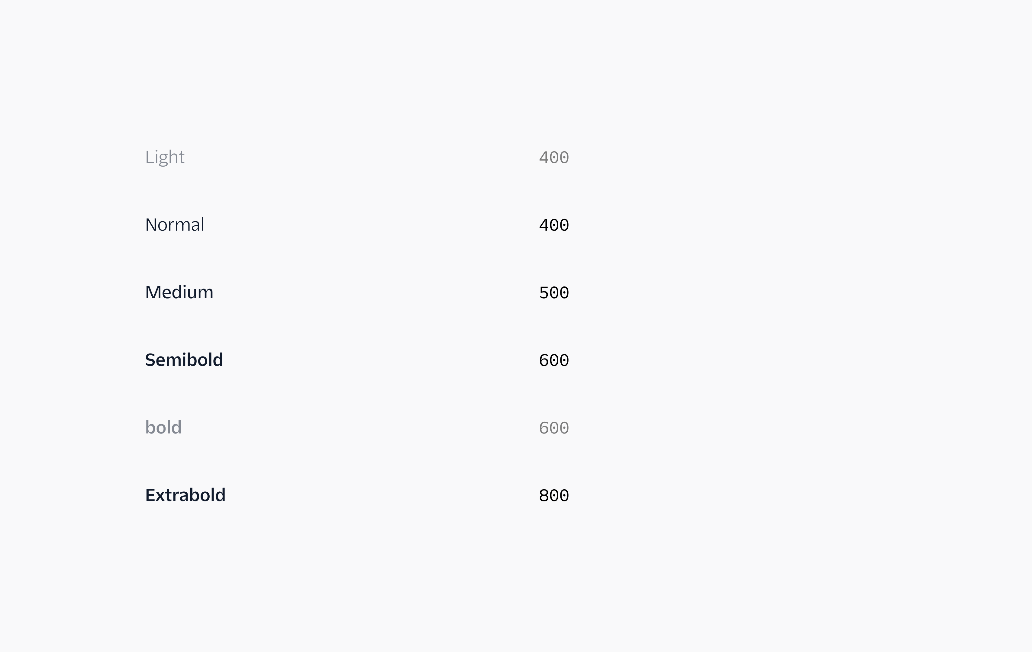
We have tokens ranging from Light to Extrabold for font weights. However, our system does not use Light or Bold. We have simplified fonts used within the product to better blend layouts and not add confusion to the visual hierarchy. If your designs use $font-weight-light, they will appear as font-weight: 400. If your designs use $font-weight-bold, they will appear as font-weight: 600.
We use Twilio Sans Text Semibold for headings and labels
We like to keep type styles consistent for customers to be able to quickly scan content and create visual hierarchy. In order to do so, we only use Semibold for headings and labels.
Font-family: Twilio Sans Text Font-weight: semibold Font-size: font-size-90 Line-height: line-height-90 Letter-spacing: -.02rem Text-color: color-text
Heading20
Font-family: Twilio Sans Text Font-weight: semibold Font-size: font-size-70 Line-height: line-height-70 Letter-spacing: -.02rem Text-color: color-text
Heading30
Font-family: Twilio Sans Text Font-weight: semibold Font-size: font-size-60 Line-height: line-height-60 Letter-spacing: -.02rem Text-color: color-text
When you have lots to say, use Twilio Sans Text Regular
In order to create juxtaposition and legibility within our designs, Twilio Sans Text’s Regular font weight is used for all body copy. This blends well and gives a nice balance with the headings that are Semibold.
Font-family: Twilio Sans Text Font-weight: normal Font-size: font-size-30 Line-height: line-height-40 Text-color: color-text
Reserve Twilio Sans Text Medium for smaller type
For captions, we use Twilio Sans Text’s Medium font weight to anchor small units of type.
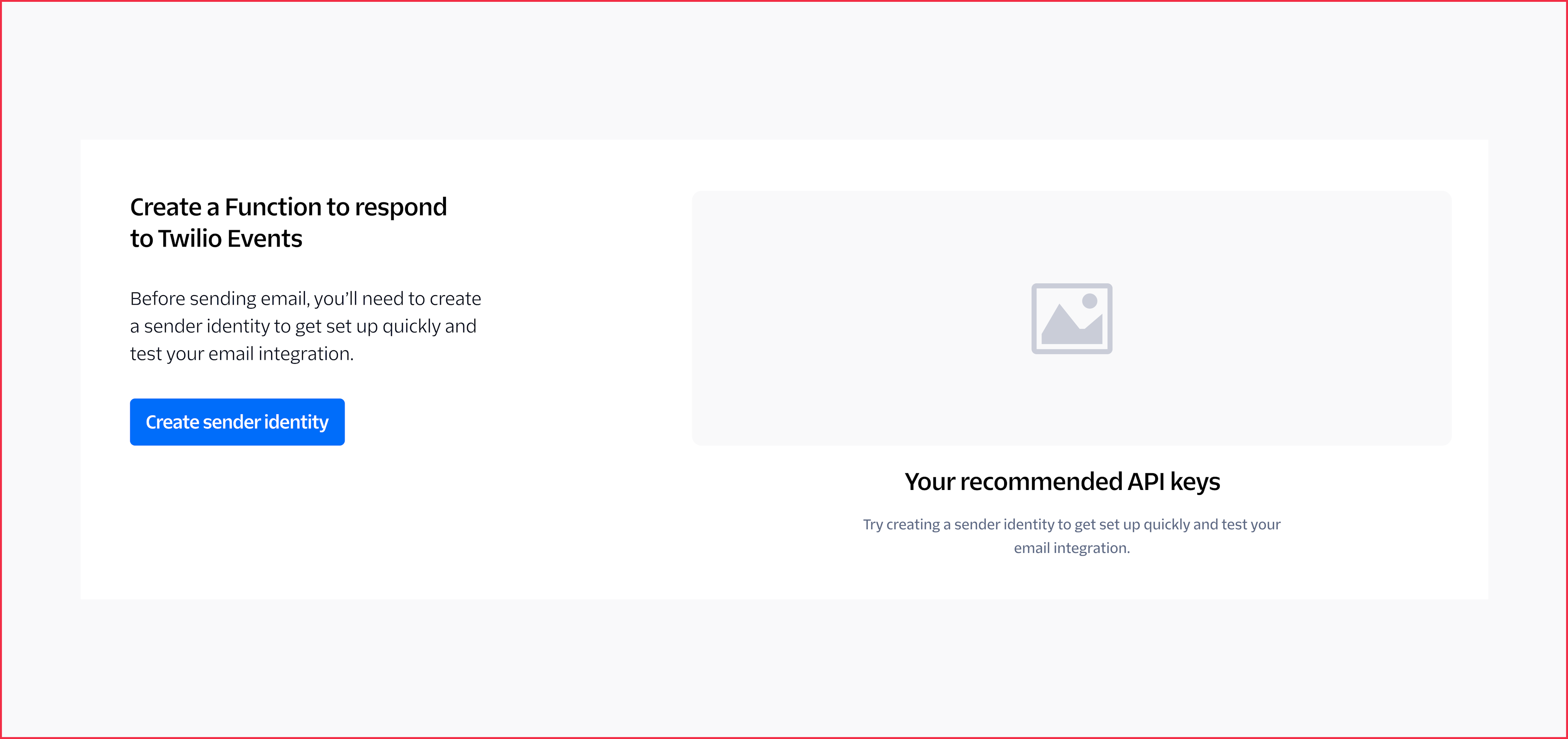
Need to display smaller, supplementary text under an image or add a footnote? Check out your new best friend, the Detail Text component.
Detail Text
Font-family: Twilio Sans Text Font-weight: medium Font-size: font-size-20 Line-height: line-height-20 Text-color: color-text-weak
For displaying coded type, use Twilio Sans Mono Regular
To display code or a programming language, we use Twilio Sans Mono Regular.
Font-family: Twilio Sans Mono Font-weight: normal Font-size: inherit Line-height: inherit Text-color: color-text-primary-stronger Background-color: color-background-primary-weakest Border-color: color-border-primary-weaker
Tokens and styles
Typography is managed through the use of design tokens in Paste. Type tokens are pre-set style decisions for font size, font weight, or leading (line height). Below are just a few examples of the many tokens and styles you can use to compose your UI’s.
Some well-loved type tokens
Size + leading (line-height)
Leading refers to the overall space between lines and blocks of content. In product, we use line-height to determine the amount of space a line of text takes up. It’s important to pick the appropriate line height with your selected type size for better readability and processing of information quickly. If your line heights look like a railroad track, they are too open. We don't want our lines of text to look too open nor too tight.
In Paste, we’ve matched our line height and font size tokens so that it’s easy for you to pair them. For example, using $font-size-40 with $line-height-40 will give you the ideal sizing and spacing pair. The same is true for $font-size-10 and $line-height-10, etc.
(information)
Heads up about font sizes in Paste
If you aren't using the Theme.Provider component, you must set font-size: 100%; on your page's html tag for the font-sizes to be sized correctly as 1rem=16px.
Text color tokens are used to define text and icon colors. We’ve created a set of accessible text color tokens to promote legibility and readability to be used on dark and light backgrounds.
We specifically have color-text- and color-text-icon- tokens, since icons have different contrast requirements. Since they are graphical objects, they only need to meet a 3:1 color contrast ratio, as opposed to text, which must meet 4.5:1. This means that icons can use any color-text- or color-text-icon- token, but text should never use color-text-icon-* tokens.
We know how time-consuming it is to fiddle with type styles to get the correct one. This is why we have created type components, so they have style built into them. You can focus on designing full layouts, and we can worry about the nitty-gritty.
Most of our block-level typography components like Heading, Paragraph, and Detail Text have preset margins so that stacking components will give your layout the ideal amount of spacing without having to adjust margins manually too much yourself.
Ever wonder why we make the choices we make when it comes to styling type?
Let’s do a small deep dive into some of our favorite tips for typography.
Alignment
When in doubt, flush left
We suggest using a left alignment for styling UI copy in left-to-right languages. This provides a stronger vertical alignment of your design and a better reading experience while seeing the hierarchy of the content. This also makes it easier to scan content, especially for users of screen magnifiers or higher zoom levels.
Do
Don't
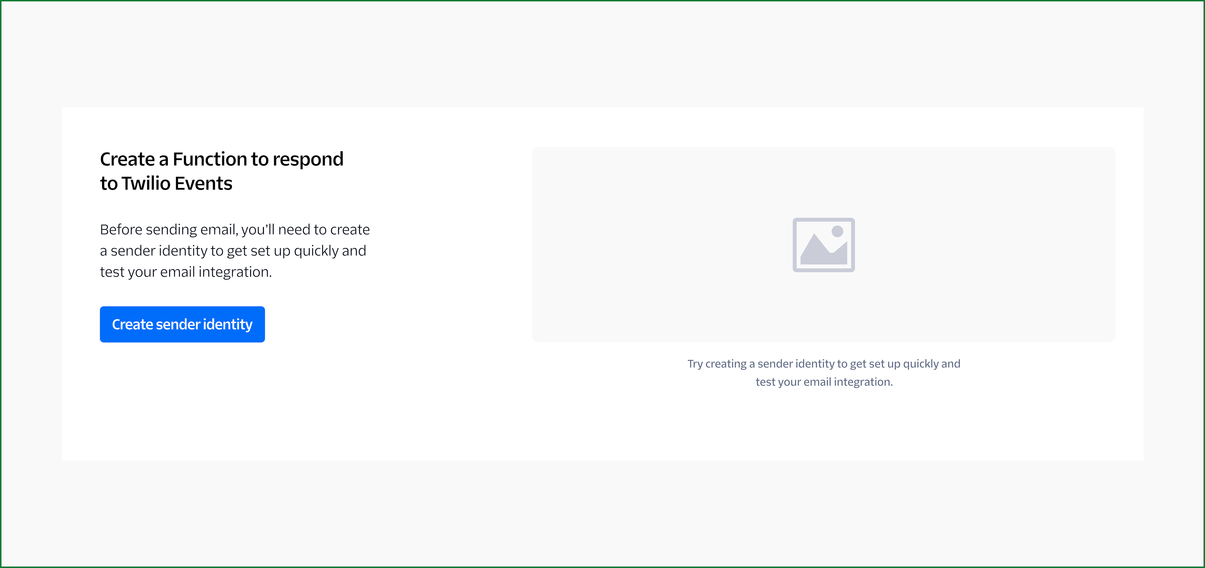
When to center type
We don’t suggest centering large groups of text, it’s not always the most effective in information design and legibility. However, it may make sense within a card or under a data visual or image if it's a small amount of content.
Do
Do
Don't
Base alignment
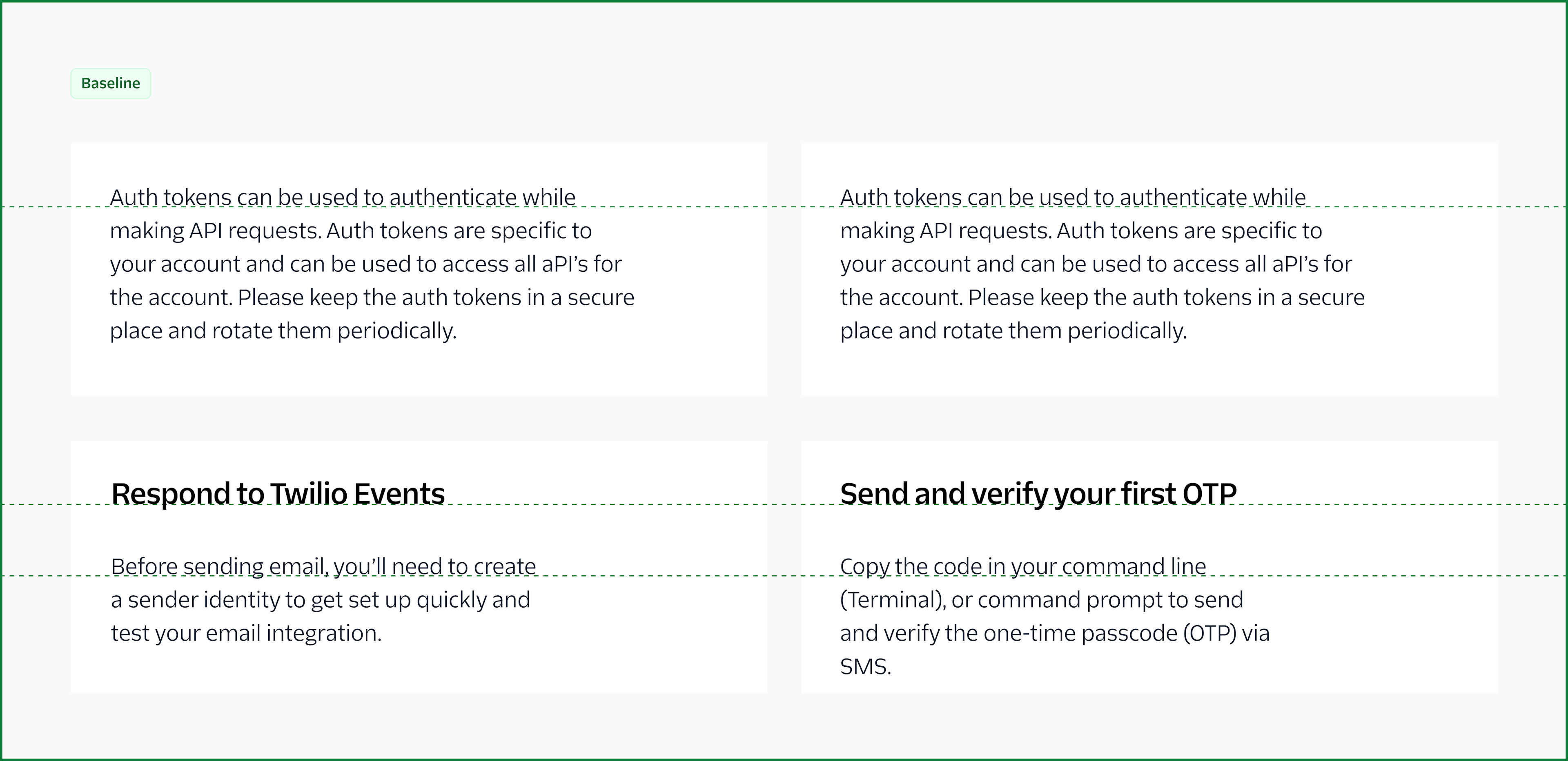
In some instances, it is helpful to bottom align your units of type instead of centering your type. This helps when you have multiple type sizes and gives a unified look. It's that it's easier for humans to scan text content when it's on the same baseline.
Do
Leading (line height)
Leading helps with legibility in your designs. Having leading too tight or too open can be strenuous on the reader. Lucky for you, Paste already uses the best line-height tokens within our type-based components to have the perfect leading already built in.
Do
Don't
Case styles
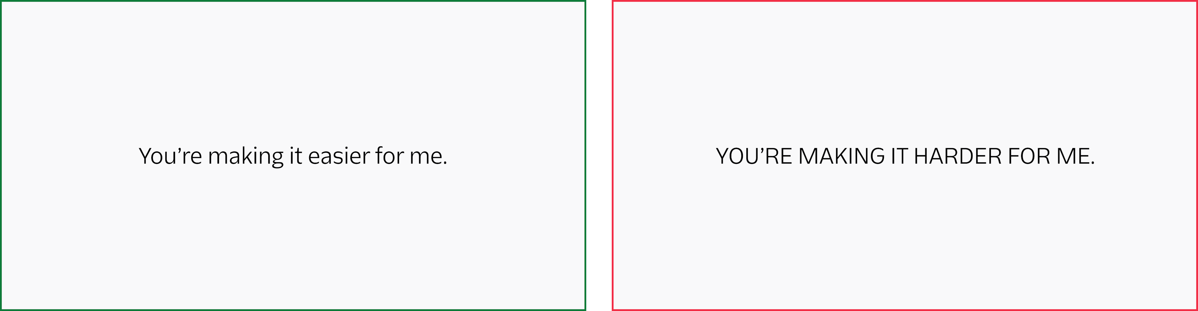
All caps
We recommend avoiding forced capitalization. It’s not accessible with screen readers, and in many languages, does not translate. It also tends to be less legible than sentence case.
Do
Don't
In almost all cases in Twilio, use sentence case
Tips on when and when not to capitalize:
Avoid setting a single capitalization design rule that fits all languages.
In French, Italian, and Spanish (among others) only the first letter should be capitalized for certain words.
In German, certain types of nouns, gerunds, and names must start with upper-case.
Developers should avoid using CSS, e.g. text-transform: capitalize; to handle capitalization.
We understand that in product, typesetting is sometimes out of our control.
However, it’s good to be mindful of awkward ragged edges in our content blocks, known as rags. We also want to be aware of orphans and widows, which is where the content breaks awkwardly, and one word is alone on a single line.
Though we may not be able to adjust content blocks as screen sizes vary, we can still be mindful of these sorts of type accidents. They are especially noticeable in headings. We suggest stacking a headline into two or three lines, versus one long line, which helps to avoid widows.
Do
Don't
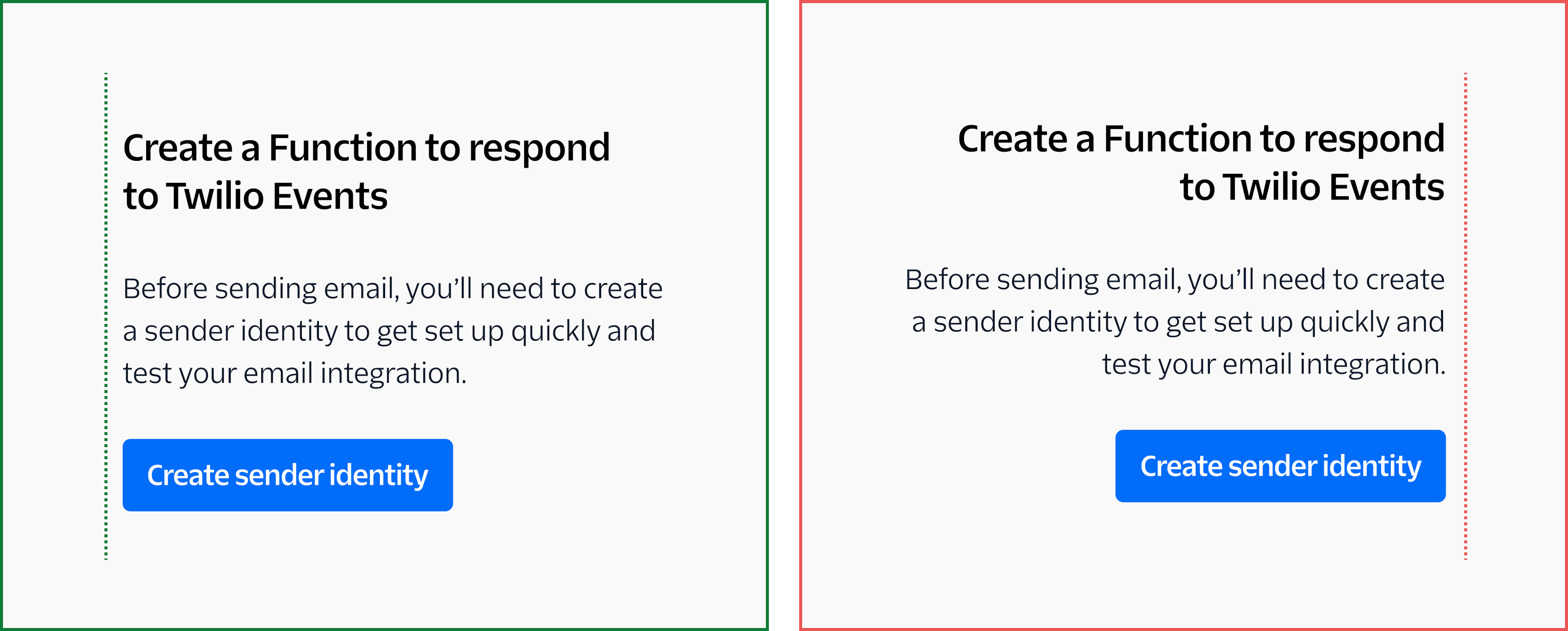
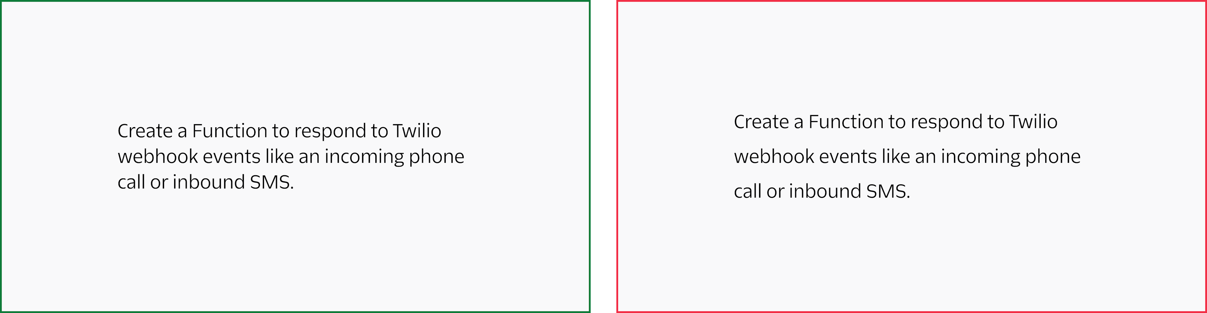
For this example, you can see the top example has a nice stacked heading that makes the headline and the body copy a compact unit.
In the below examples, you can see one heading and one word in the paragraph are alone, which is harder to scan, but also feels unrefined. The second example has a one line headline which feels disjointed from the rest of the content, as the paragraph line length is shorter. This makes the heading not feel as visually impactful as when it could go to two lines. We want to use design to not only add functionality, but to make a statement.
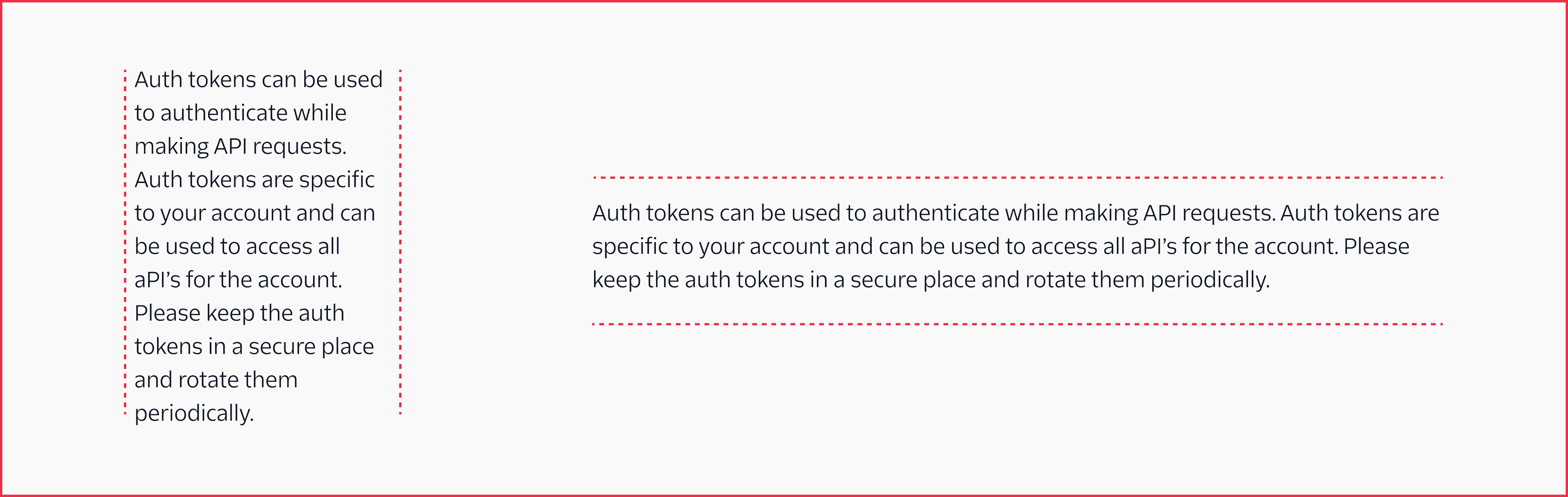
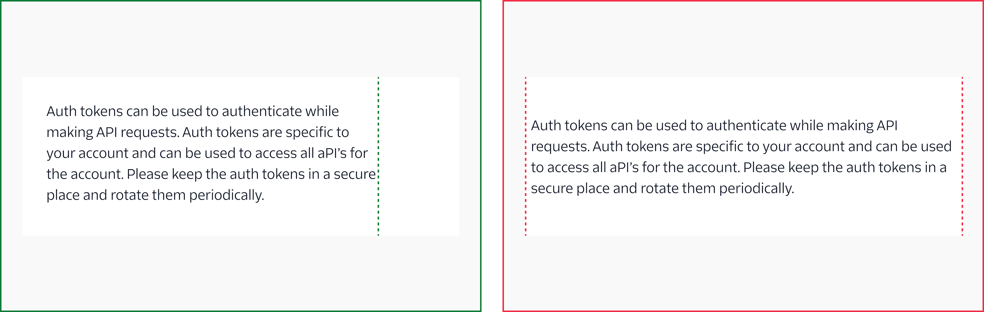
Text wrap (line length)
We want to create comfortable reading for our customers. We suggest no more than 120 characters per line. When working with line lengths we want to create short, but efficient lines of text, so the content is easier to scan, it's readable, and not overwhelming.
Do
Don't
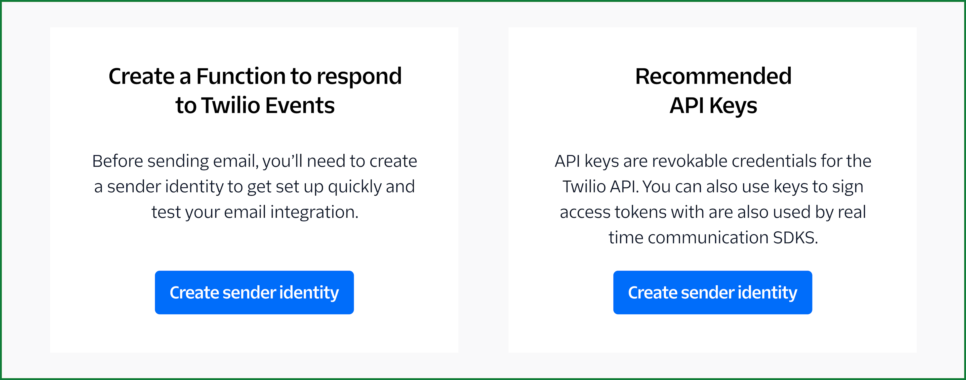
It's also good practice to give more padding (space) if your content is within a container. Just like us humans, our type doesn’t like to feel claustrophobic.
Do
Don't
Let’s play with type ✨
3-minute type zhush
Stack headlines into two or even three lines instead of keeping them one long line (44 characters or more). This helps create a compact reading unit.
A good rule is to use no more than 3 type styles (semibold, medium, regular fonts). This helps blend type styles properly and not get carried away.