Illustrations
Guidelines and repository of illustrations that can be used in Twilio UIs.
Illustrations help breathe life into our brand. It can take a complex idea and make it easier to understand. It is a tool that allows us to communicate our product in a way that feels human and fun.
- Our illustration style is carefully curated by the Twilio Brand team. While adding these elements to your UI, ensure that you are reviewing your work with them. Read the brand illustration guidelines. If you don’t have access, request application access through ServiceNow for "The Library (Bynder)".
- Avoid overusing illustrations as it can diminish their emotional and visual impact.
- Whenever possible, opt for SVGs over PNGs to improve performance and prevent blurring.
- Aim to pair your illustrations with text: Remember that different cultures may interpret the same image in different ways, so despite our best intentions, it is helpful to provide adjoining text.
- Illustrations shouldn't include navigational interactions: Illustrations should not have interactions such as click or hover behavior that is essential to navigation and usage of the product. Instead they should be wrapped with an (or, ideally, laid out with supporting) interactive element such as Anchor.
- Give your illustrations a title: An SVG title or image alt text is required on non-decorative illustrations so assistive technology can infer equal meaning as a sighted user would. For example, avoid a title that reads "WhatsApp Illustration - 01". Instead a title that says "Get started with our WhatsApp API" is preferable.
Spot illustrations are the most literal expression of a concept, designed to directly relate to the content, especially useful in limited space scenarios.


They often use iconic and repetitive elements to maintain consistency and facilitate learnability across patterns like empty states, error messages, or feature comparison.
Medium scene illustrations blend real UI screens with people and other graphic elements, creating stories to support content in a more conceptual way.


They maintain a consistent style across characters, devices, and decorative elements and are good for providing contextual support for welcome messages, highlighted features or onboarding guides.
Photo illustrations blend illustration and photography to produce dynamic, branded assets primarily intended for marketing usage. They can also be sporadically integrated into the product for upselling or other marketing purposes.


Consider the context before adding a photo illustration, as they often represent specific user types. Use restraint, especially in busy or heavily branded environments.
You can access a selection of illustrations for products available in the Figma Web Spot Image library, which is managed by the Web and Brand teams. Turn it on in your local files for easy access, and use the illustrations in the “Product Illustrations” sticker sheet
For the complete illustration collection, browse the illustration library in Bynder (VPN required).
Illustrations are used sporadically in the product, and should support the overall message, not just be visual ornaments. These are some common uses of illustrations around the product.
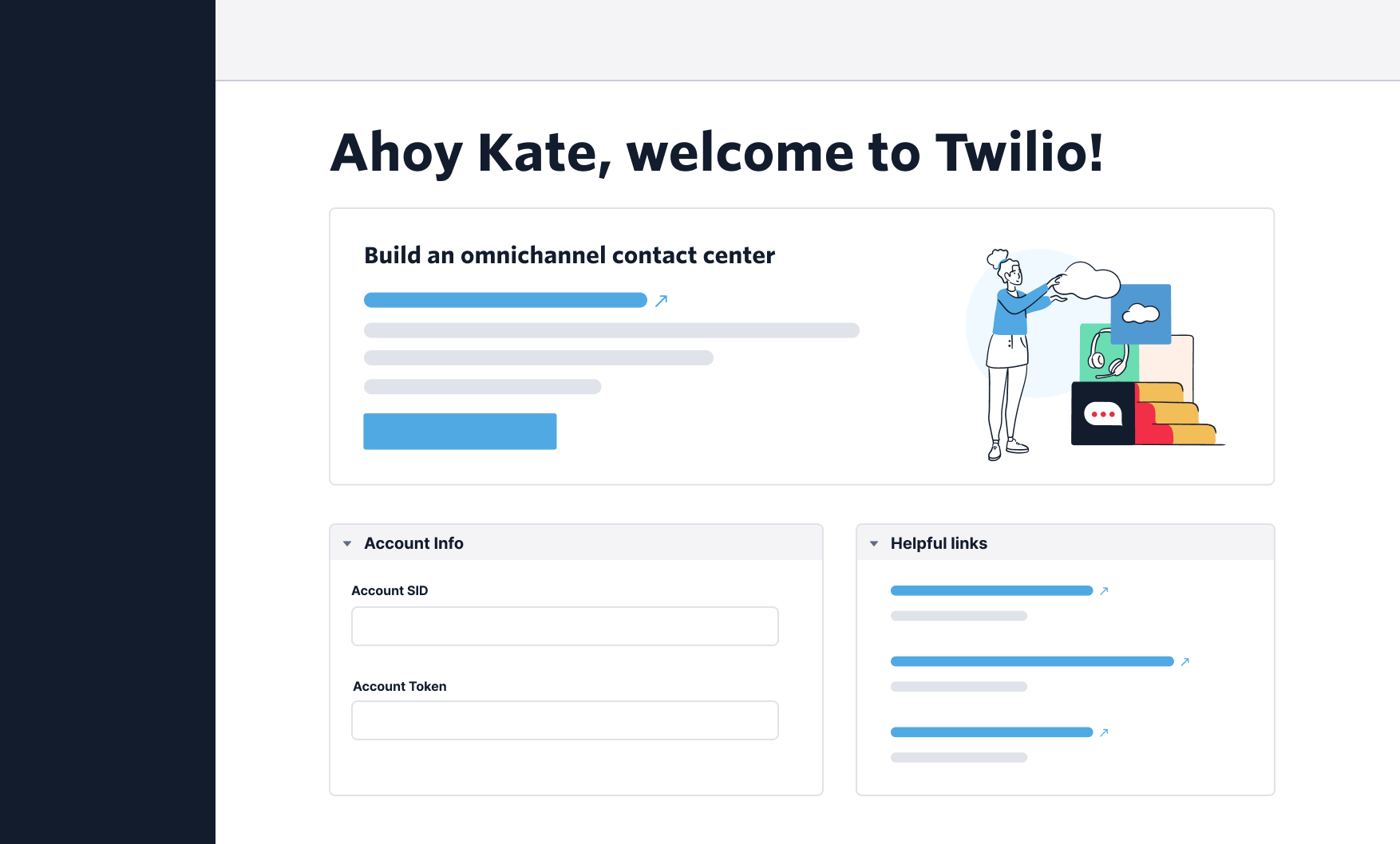
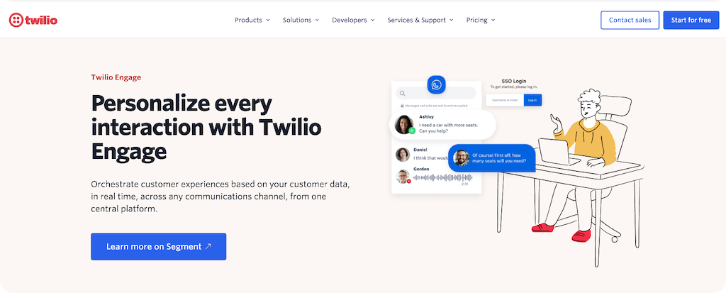
Illustrations are commonly placed on the right side of the header section to offer a friendly welcome to users. Keep each welcome screen to only 1 illustration to prevent overcrowding and maintain a minimalist aesthetic.
Illustrations are positioned on the left side (or top for small screens) when users access a new/empty part of the experience. It helps to add visual interest, ensuring users don't miss what they need to do to continue. Read more about the empty state pattern.

Illustrations are placed on the left side (or top for small screens) for error states, aimed to alleviate frustration. Keep in mind using multiple illustrations for different error states on the same screen may lead to confusion and increased frustration. Follow our Error state pattern carefully when adding error states and illustrations.

Illustrations are used to draw customers' attention to upsell and cross-sell opportunities. They serve as eye-catching elements, but it's important to be mindful of the number of illustrations on the screen. If every upsell or cross-sell opportunity is illustrated, it can diminish their effectiveness. Read our guidelines for marketing Cards and cross-sell opportunities.
- If a pre-made illustration doesn’t fit the layout you can slightly adjust to
better match your design:
 Do not add outside elements to the illustrations. You may remove unnecessary elements, but do so while maintaining the thematic feel that the illustration is trying to convey.
 - If existing illustrations don't convey your use case, you can create a new
one by combining elements from different premade illustrations. For example:


 Make sure you partner with Brand and review your work with them.
 - You can also request a new illustration by filing a request with the Brand team. Follow these guidelines on how to request a creative asset.
- Create a frame with the specific size required for your illustration.
- Name the frame following the accessibility guidelines provided above.
- If you downloaded your .svg from Bynder, drag the SVG file from your computer and place it within the frame.
- Leave
space160around the illustration so you’re sure no element will interfere with it
- Leave
- If you are using the Product Illustrations sticker sheet, turn on the “Web Spot Image Repository” library in your assets panel.
- Make sure you configure the illustration to fill the frame so you can resize freely.
- Many illustrations from this library already have padding. If they don’t, leave
space160around the illustration so you’re sure no element will interfere with it.