Paste Design System Newsletter - June 2023 Edition

Navigation UI Kit now available in Figma 🎉
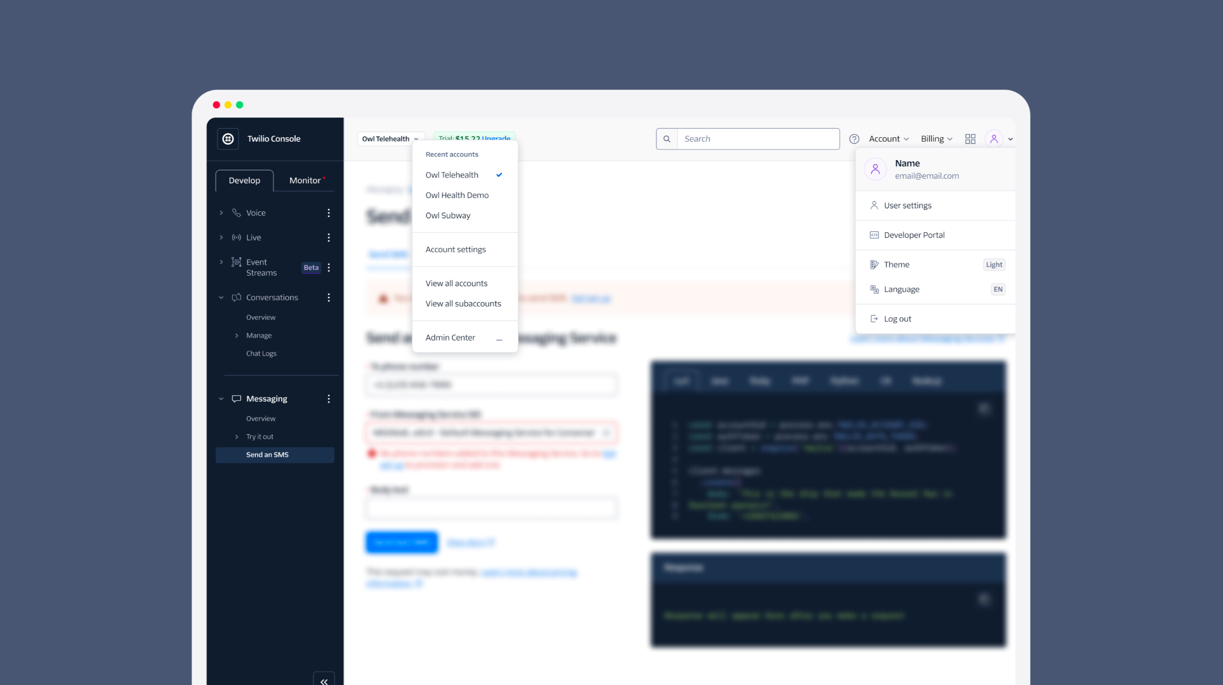
Throughout Q1, we collaborated with you to design a universal Navigation UI kit for every Twilio application. The aim? To begin the process of creating a cohesive user experience as customers navigate between our product offerings. This includes everything from Console to Segment, and from Sendgrid to Flex and Engage.
We’ve built design assets in Figma for teams to compose their navigation frames across Console, Segment, Aion, and SendGrid, including:
- Sidebars
- Topbars
- Account/workspace switchers
- User dialogs (aka user menus)
- And more!
Our company's goal shouldn’t be to produce stand-alone products, but rather to gradually create a seamless and intentional collection of them. Don't worry, achieving cohesion doesn't have to be a monumental task — The new designs accommodate all existing features across these products.
Our focus is not on overhauling information architecture or application features, but on visually aligning our existing products. The design assets are now available in Figma. Look out for the upcoming React components in our next release!
Introducing Error Messaging Content Guidelines
We understand how frustrating a poorly designed error message can be. Thanks to the incredible efforts of Megan Allison, Content Designer for Segment, we now have a guide to help you create informative, helpful, and appropriate error messages.
The newly published Error State pattern offers advice on crafting and displaying different types of error messages. Together with Aren Goetcherian, the team have also provided revamped, context-specific suggestions throughout the Paste docs site to aid in error messaging.
So the next time you need to write an error into a user flow, be sure to check out the new Error State pattern.
Refined Avatar component and new Avatar Group

We've given the Avatar component some much-needed care, adding features like the ability to display a collection of entities or humans in a single group.
With this improvement, the Segment team can now replace their Evergreen-based Stacked Connections with the Avatar Group. This universal component can be used across all Twilio products for a variety of use cases.
Remember to check out the updated docs for new visual tweaks, expanded examples, and how to update your Paste dependencies to get the new Avatar Group in your application.
Refreshed Tabs: A new look

We've given Tabs a makeover too, to look more... well, like tabs!
To avoid confusion between in-page navigation and tabs, we've made these two fundamentally different UI components look distinct from each other. Now you can easily choose the right UI concept for your task.
Tabs update the content of your current page, while in-page navigation takes you to an entirely new page. We hope this visual update will help guide your user interactions. This refresh to Tabs is available today in both the Figma and React libraries.
- We’ve extended the functionality of the Styling Library to include additional features of Emotion CSS. This allows Paste powered applications to take advantage of native CSS style encapsulation via Shadow DOM. It's particularly useful if you're embedding Paste into an existing website, and you don’t want your styles to clash.
- Also, Brandon Scott, an engineer on the Segment App Foundations team, has enhanced the VS Code Paste plugin. It now shows a color preview of any design token you're using in code. As we understand how challenging it can be to transition from an existing library, we hope this update simplifies the process and makes life a little better during the onboarding process.
- The Progress Steps component was released in Figma.
- Text styles were added to each theme in Figma to support more streamlined theme-switching.

Our mate this month, Megan Allison, isn't a new name to this newsletter. Megan is a content designer at Segment and has been continuously working on enhancing our documentation.
As Segment embraces Paste, Megan has been there every step of the way, supporting product designers in translating existing designs and patterns into the Paste ecosystem. She's been taking a deep dive into our documentation, refining the guidance we offer to designers and developers.
What's amazing about Megan is her 'One Twilio' spirit. Instead of just focusing on guidelines for Segment, she's been putting her time into improving centralized guidelines, so everyone at Twilio can benefit.
Here at Paste, we love seeing cross-company collaboration. It's even more exciting when it involves a specialized skill like content design. Megan's decision to share her expertise broadly helps us all build better products, amplifying the impact of her work.
We can't thank Megan enough for her contributions. Her dedication to creating a better Twilio is truly inspiring. Thank you, Megan, for embodying the spirit of collaboration and making a big difference in Paste and Twilio!
| Feature | Description |
|---|---|
| Navigation UI Kit components | Complementary React components to implement our Navigation UI kit. |
| Progress Steps component | A highly requested component that shows a user a clear path to complete a complex multi-step task. |
| Number Input component | An input that limits data to number entry and has styled +/- buttons. |
| Status components | Components that implement the Object Status Pattern, including Status Badge and Status Menu. |
| Checkbox and Radio Menu Items | A menu that presents a list of items that a user can choose to perform an action with. |
| Design of the Slider component | A component that allows a draggable input over a range of numbers. |
As always, we’re better together.
— The UX Infrastructure Team