Paste Design System Newsletter - April 2023 Edition

We are excited to announce that the new One Twilio Design Language is fully live!
This update comes from an initiative to create a cohesive design language to unify Twilio’s product suite. Learn more about the work on the Twilio Blog: "Bringing Cohesion to the Twilio Product Suite"
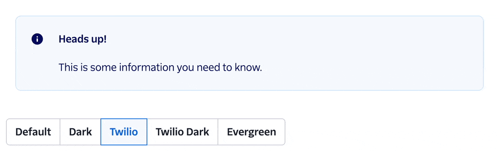
The update can be seen now on the Paste site. This update comes through 3 new themes: twilio, twilio-dark, and evergreen. For details on each theme, visit our theme documentation.
To determine a timeline for upgrading to the new design language in your product, check out our recommended process and suggested timeline strategy. We recommend most product teams migrate their top and side navigation bars to use Paste Navigation UI Kit components (estimated for Q2 release) before swapping from their existing theme to the twilio theme (recommend Q3–Q4).
Look for even more details about this design language update and the Tess Hannel for her leadership on this project with the Paste team 🌟.
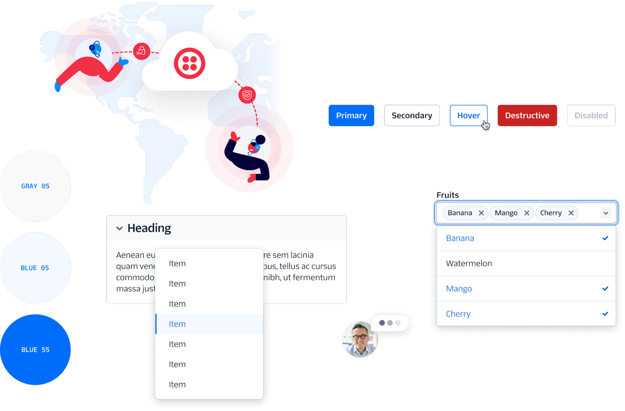
Check out the new design language on display
Typography Guidelines
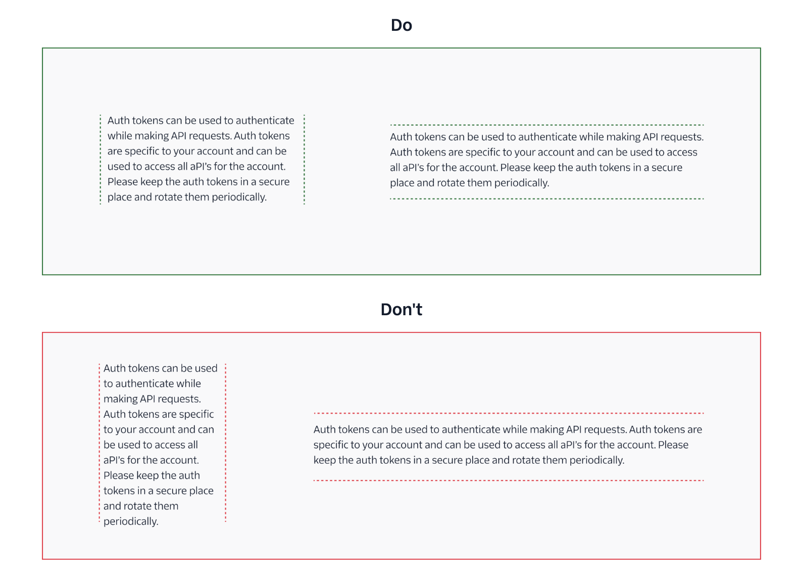
Our newest foundations page on Typography shares guidelines on how to set type in Twilio products, using our new design language and typefaces, Twilio Sans Display, Twilio Sans Text, and Twilio Sans Mono. If you’re looking for help in making a decision on how to use a near-infinite combination of font families, sizes, colors, weights, line-heights, and more, and make sure all those text combinations work together on a page, these guidelines are for you!
Detail Text Component
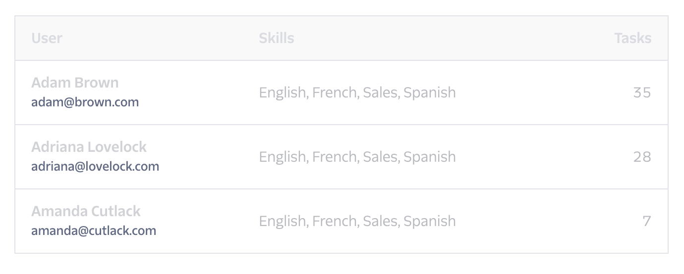
The Detail Text component is used for small pieces of text that are secondary to body text in a page. Use it for an image caption, in a chart legend, or as a paragraph footnote.
- Added 68 new icons to support: Segment, Rich-text editing, Aion (TimeIcon), Console (TrendUpIcon, TrendDownIcon, ProductVoiceIntelligenceIcon), and Twilio customer requests (StoreIcon). Thanks, Emma Sims and Colleen Yerkes for their collaboration and reviews on these!
- Popover: Updated with more detailed documentation and examples based on feedback from the Design Systems Committee. Thanks, all!
- Toast: Added a
leftprop to make Toasts more mobile-compatible. Thanks for the suggestion, Claudia Zhou! - Side Modal: Increased the default width of Side Modal to better align with Segment use cases and content. Thanks for the suggestion, Darci Meachin and Chris Chan! Side Modal also received a little TLC with a new animation ✨.
Objective: Establish Paste as the standard UI framework for Segment, and unify Twilio customer experiences in a single, beautiful Design Language update.
| Key Result | Status | Notes |
|---|---|---|
| 100% of Paste components updated to new design language | 🎉 Complete | |
| Designs for a unified or universal Navigation and Masthead reviewed and approved by downstream applications; Aion, Console, Sendgrid and Segment | 🎉 Complete | |
| Segment-themed Paste shipped in Segment Core App with 1 Paste component in production. | 🎉 Complete |
Objective: Drive reliability, resiliency, and quality in Twilio products through investments in infrastructure
| Key Result | Status | Notes |
|---|---|---|
| Monorepo dependency management is automated and key dependencies are updated on an agreed cadence | ❌ Incomplete | Mid-quarter revision: Replanned for Q2 due to capacity constraints |
| Fully support the use of Paste inside a React 18 application | 🎉 Complete | |
| Decrease resiliency ticket backlog by 25% | ❌ Incomplete | Mid-quarter revision: Replanned for Q2 due to capacity constraints |
| Avg CI runtime/s is reduced by 20% | 🎉 Complete | |
| Graduate 2 components out of stage 1 status | 🎉 Complete Popover | Mid-quarter revision: Decreased KR to 1 component from 2. |
Objective: Establish the foundations for best in class product and visual design at Twilio
| Key Result | Status | Notes |
|---|---|---|
| Creation of 1 content design pattern | 🎉 Complete | Error Pattern |
| 10 designers attend visual design office hours | ❌ Incomplete | Mid-quarter revision: No longer tracking. |
| 2 new Design Foundations Guideline added to the Paste docs site | 🎉 Complete | Typography and Spacing and Layout |
| Establish the baseline CSAT score for Foundational design guidelines in Paste | 🎉 Complete | 38% of respondents are familiar with them but haven’t used them. 56% of respondents have used them. Most useful guidelines: Spacing & Layout. Least useful guidelines: Illustrations |

In this edition of Pastemates, we're spotlighting a mate from Twilio’s Data & Applications BU, Colleen Yerkes! Colleen’s been instrumental in advocating for Paste within SendGrid Marketing Campaigns.
Despite her product team’s tight timeline and unique use case within Twilio’s product suite, Colleen has been highly adaptable in her collaboration, leveraging office hours, GitHub Discussions, and our dependency tracker in the best ways depending on the type of questions that came up as design and development progressed. Colleen’s leadership in this work and thoughtful questions have pushed our design system and team to more deeply consider how components and layouts provided through Paste can be used throughout canvas-based customer experiences.
Look for more updates from Colleen as these features move into Twilio Engage!
| Feature | Description |
|---|---|
| Navigation UI Kit | A collection of components that can be used to build shared, global navigation patterns for Twilio, Segment, and Flex applications. Available in React and Figma. |
| Avatar Group component | A component that stacks avatars horizontally with an expanded menu for overflows. |
| Avatar component, refined | This update to Avatar refines the documentation in preparation for Avatar Group. |
| Tabs component, refined | This update to Tabs refines the design to create distinct visual hierarchy within a page for tabbed content and when paired with the In Page Navigation component. |
As always, we’re better together.
— The UX Infrastructure Team