Paste Design System Newsletter - September 2022 Edition

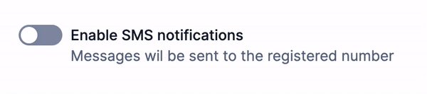
The Switch component makes interacting with binary states a breeze. Our Switch incorporates animation and icons to make its pressed/unpressed state visually clear, while its built-in accessibility features communicate the state clearly to users. Take it for a spin!
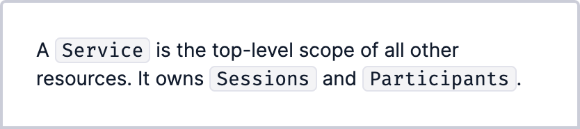
If your snippet of code is small and inline with the rest of your text, Inline Code is the way to go. Its contents stand out with a subtle background and monospace font. Use it for code, ID's, and keys.
Check out the Inline Code docs
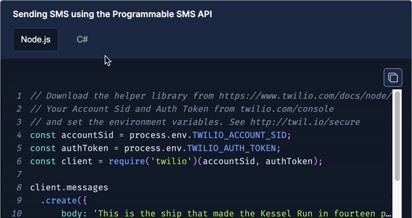
Presenting Code Block! This component allows you to display code with syntax highlighting for 13 programming languages. It features tabs to show different blocks of code in the same area, a copy code button, and an optional external link button leading to the source code.
With five different variants to choose from, all your imperative, static information will be hard to miss inside of the Callout component! Don't forget to set its heading level according to the outline of your page for the best user experience.

As part of our Conversations UI kit, we've added the Minimizable Dialog component. Its power lies in its flexibility; use it with a static button, a floating button, or use its included state hook for full control of its internal state. Making a chat log has never been easier with Paste.
Check out the Minimizable Dialog docs
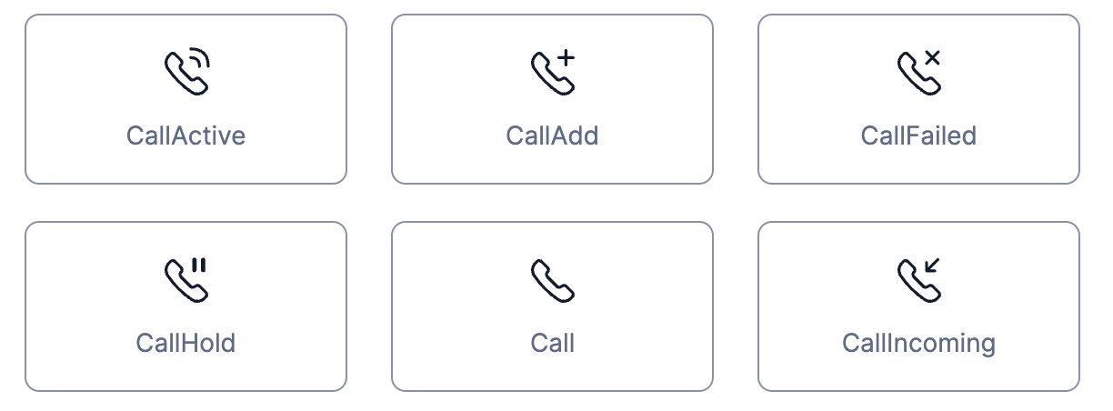
We've got new icons! A full suite of contact center icons and more are now available. Thanks to Fazle Jahangir, Isabela Razetti, and Porlin Chin for their close collaboration on these icons.
View the full list of new icons and search through our full icons list
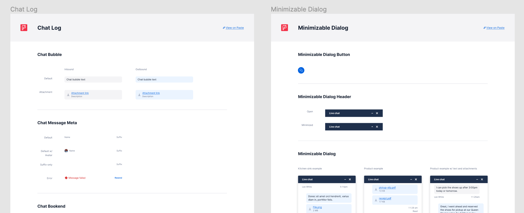
Our Conversations UI Kit, which includes all of Paste's chat components and the new minimizable dialog, is now available in Figma. The components in this kit work together seamlessly for designing conversational UI, no matter the complexity.
Start designing with the Conversations UI Kit

Let's toggle! To make a button a toggle simply add the pressed prop to a secondary button or secondary icon button.
Check out the Button toggle docs
Sticky headers in Table and Data Grid (contribution)
Contributed by Mark Yang from the Billing Platform team, sticky headers for our Table and Data Grid components are now available! Use this functionality to make perusing data easier, especially on mobile viewports. Thanks Mark! 🎉
Check out sticky headers in the docs
- Help text variants: warning and success
- Menu: destructive variant for menu item
- Refreshed styling for Combobox and Select chevron
| Components we support | Repositories using Paste | Component instances in production |
|---|---|---|
| 48 | 148 | 55,394 |
The Design Systems team keeps a pulse on Paste users with our annual CSAT survey. Thank you to each of the 68 Twilions who provided feedback on their Paste experience! Our survey used a scale of 1-5 (1 being strongly disagree, 5 being strongly agree). We are excited to the share the following insights:
When asked how strongly they agreed to Paste being easy to use to design and build customer interfaces, our participants averaged 4.00/5.
When asked how strongly they agreed to being proud of the behavior of their products when using Paste, our participants averaged 4.18/5.
In addition, some participants specified:
It's great to have a standardized component library that lines up with Twilio standards. It allows me to focus on my business logic.
I really appreciate how approachable Paste is - it's really easy to get up and running.
These results are music to our ears 🎶
Pastemates are individuals and teams who have been critical contributors to Paste, through advocating for adoption within their products and channeling important feedback and contributions back into the system.
Since our last update, Ramona Thompson joined the One Twilio BPM crew to partner with us in our user research efforts. Ramona collaborated with us to help us dig into what customers consider friendly, clean, and more importantly what feels like Twilio. She led research to measure how a new visual design direction performed against existing customer ratings of live Twilio products, as well as how different brand expressions (think typography, color, and illustration) impact our customers' perception and preferences. Ramona was a 🌟superstar🌟 in our research phase and we are grateful for her efforts.
| BPM | Status |
|---|---|
| Establish Paste as a leading Next-Gen Monorepo through tooling and infrastructure improvements | 🟢 Green: Migrated our Visual Regression Testing suite from Applitools to Percy, improving test times by over 20% while additionally testing in each browser. Expanded on our DangerJS PR checks to verify dependencies are pinned to prevent inconsistencies in builds. |
| Evolve the Twilio design language to support the vision of “One Twilio” | 🟢 Green: After syncing with stakeholders and brand, along with reviewing the research findings, we narrowed down our visual design concepts to a single direction and have been eagerly working on creating revamped components in the new design language. Next, we'll be using these revamped components to do some product stress testing that will help us
|
| Lay the groundwork for our new program management, content, and visual design disciplines | De-scoped due to changing priorities. |
| Build a UI kit for the Twilio Conversations API | 🟢 Green: The Conversations UI Kit components are now included in the Paste Components library in Figma! We have also released circular button sizes and the minimizable dialog component in code. |
| Paste goes international | ✅ Done: Paste now fully supports Twilio’s internationalization efforts for Q1. Paste components are capable of supporting translated content and do not rely on any hard-coded strings. |
For more information, check out our full BPM document.
| Feature | Description |
|---|---|
| Multi-select Combobox and Combobox refined | Improvements to the existing combobox component, with a design refresh and added functionality to select multiple items. |
| Avatar component, entity variant | A new variant for the Avatar Component that makes it a square shape representing an entity. |
| Button Group component | A group of related Buttons, ex: buttons in a toolbar. |
| Conversations API UI Kit | All Conversations UI Kit components will be ready to use, along with a landing page s on the Paste website |
| Radio Button Group | A Radio Group that looks like a Button Group |
| File Picker component | Input component used to upload or attach files |
| Side Modal component | Dialog that covers one side of the screen |
| Finalize One Twilio design direction for implementation | The One Twilio design direction includes product prototypes in the new design language and component-by-component comparisons of upcoming changes. This iteration of the design direction gets it ready for implementation in Figma and code (scheduled for a 2023 Q1 release). Further stress testing and workshops with product teams will happen in parallel with implementation in 2022 Q4. |
See you next time! 👋
— The Design Systems Team
- AcceptIcon
- BusinessIcon
- CallActiveIcon
- CallAddIcon
- CallFailedIcon
- CallHoldIcon
- CallIcon
- CallIncomingIcon
- CallOutgoingIcon
- CallTransferIcon
- ChatIcon
- ClearIcon
- DialpadIcon
- DirectoryIcon
- DocumentationIcon
- DoNotIcon
- DragHorizontalIcon
- DragIcon
- DragVerticalIcon
- EmailIcon
- EmojiIcon
- FileAudioIcon
- FileImageIcon
- FileVideoIcon
- FileZipIcon
- FlagIcon
- LogOutIcon
- MenuIcon
- NotificationIcon
- ProductContactCenterAdminIcon
- ProductContactCenterAssessmentsIcon
- ProductContactCenterQueuesIcon
- ProductContactCenterTasksIcon
- ProductContactCenterTeamsIcon
- ProductPayConnectorIcon
- ShareIcon
- SMSIcon
- StarIcon
- SystemStatusIcon
- TranslationIcon
- UploadIcon
- VoicemailIcon