After this date, you can continue to use Paste. Our documentation will remain available in the GitHub project.
Tokens
Design tokens are named units that store visual design attributes.
Design tokens make up the smallest base parts of a design language and help distribute it across different platforms and technologies. This helps to create a more seamless user experience across products and digital properties, no matter how they are built, by allowing that visual design language to be shared from a single source of truth.
As the attributes of a design language are never hard-coded into any file, an evolution of the design language can be made with fewer updates to design assets and products by just updating the token values from that single central source.
All Paste components use design tokens. Additionally, styling primitives with tokens unlocks the ability to create custom UI that still uses Paste.
Need a token that doesn't exist in Paste yet?
We add new tokens every so often when there’s a strong semantic purpose that can exist across multiple products. If you think you have a need for a new token, please start a GitHub discussion.
For more information about how Paste is built and where tokens fit into that hierarchy, read About Paste.
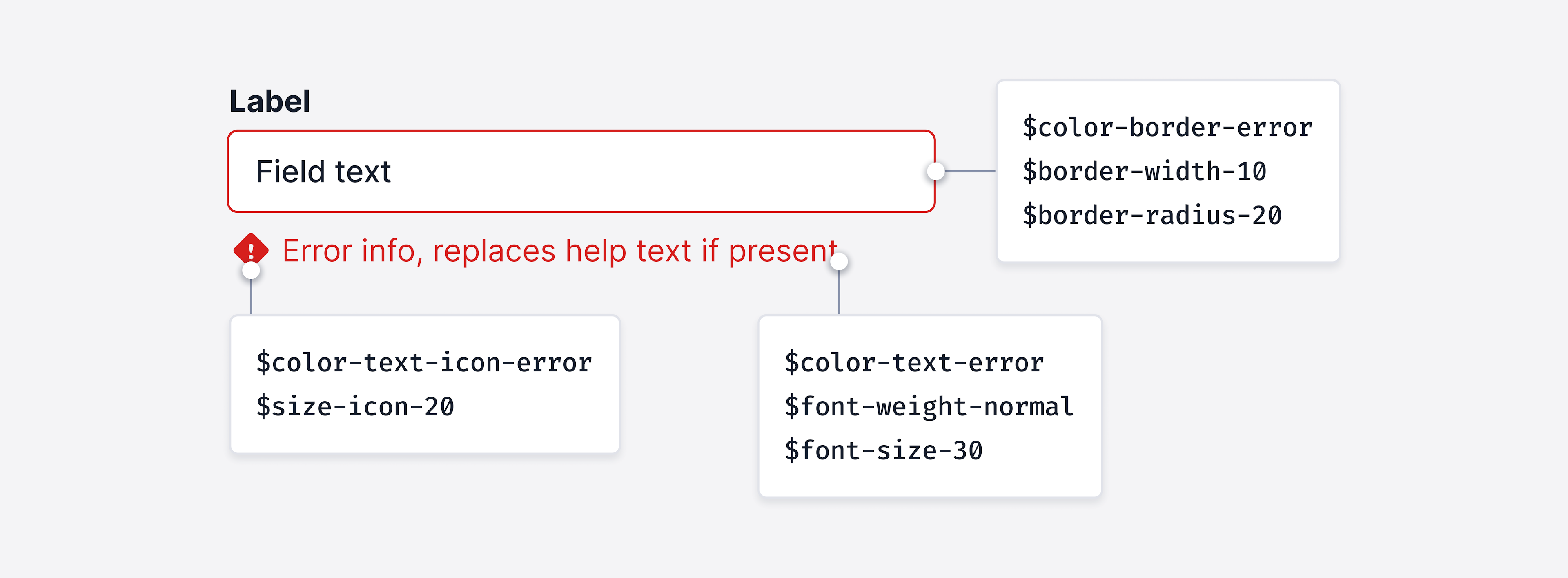
Design tokens represent fundamental decisions of Paste’s design language, specifying their intended usage with their semantic naming in a predictable and clear way. For example, $color-text-link-destructive is used for displaying link text that communicates an action is destructive. Using the appropriate token ensures that all destructive actions are styled consistently, appearing as red text in this case. Once a token name is created, it can never change, or be removed.
Tokens are named semantically to specify their intended usage. The format of a design token name is:
$type-category-instance-variant-state
Do
Name a token based on its use case or purpose.
Don't
Don't name a token based on its value.
Types are the high-level, foundational styles the token will be applied to, such as color, type, size, spacing.
Categories are the UI entities the token will be applied to, such as background, border, radius, font-size.
Instances are the occurrences in which the token might be used to express that instance in the UI, such as success, warning, error, link.
The variant of an instance token, such as weak, weakest, strong, stronger.
State in which the token should be used, such as hover, focus, selected.
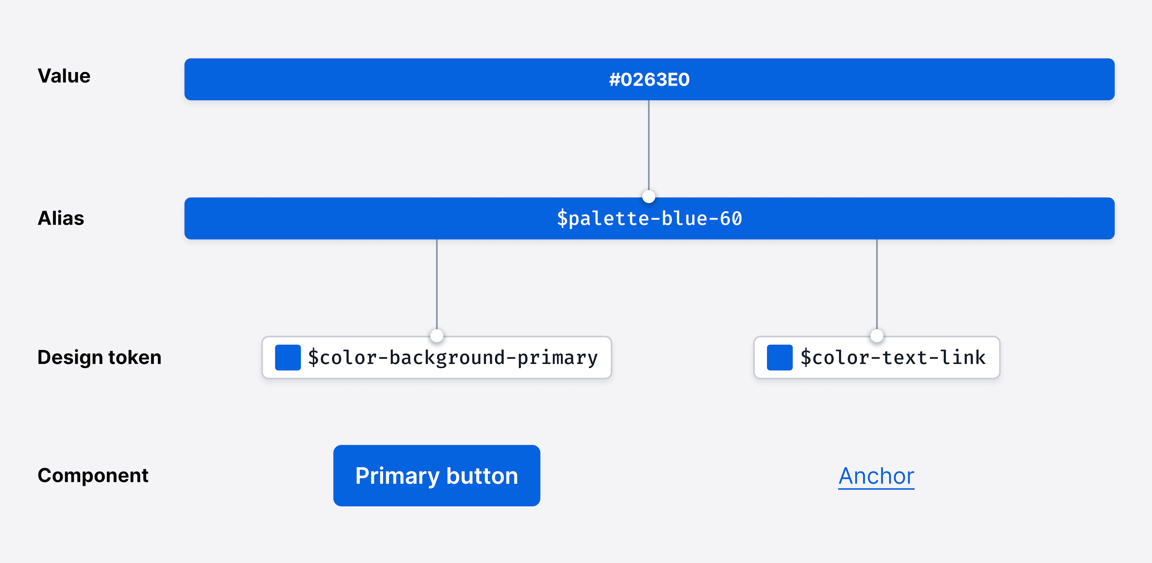
Some tokens in Paste leverage an additional layer of abstraction beneath tokens, called aliases. Paste’s design tokens point to an alias to define their value, while the aliases point to hard-coded values, such as hex codes or RGB values.
Right now, Paste leverages aliases only for color. Paste’s color aliases are the primitive form of the colors in our palette. All of Paste’s color tokens reference our aliases. Aliases are never directly used in the implementation of Paste UI; only tokens can be used.
We use aliases in Paste to help codify and systematize the desired value that can be referenced by our semantically-named design tokens.
One benefit of this approach is that tokens will reference aliases instead of hard-coded values, which reduces the need to implement duplicate values. Sometimes a token may need to use the same value as another token; for example $color-background-primary uses the same hex value as $color-border-neutral, but both just reference the alias $color-palette-blue-60 to define the color.
Another benefit of the approach is that it enables flexibility. If there’s a need to make a change to an alias and have those changes applied system-wide, we only need to change that single alias for it to propagate to everything that references it. This reduces our need to “find and replace” on a large scale.
Alternatively, if we want to make a change to a design token, and not the alias, we can isolate the change to just the design token. For example, if we want to change the $color-background-primary token to use orange instead of blue, we can point that token at a different alias rather than changing the alias itself.
Themes are collections of design tokens that reference specific values. The values can change per theme.
Themes can only change the values of properties that are already set on a component. For example, you might change the border or background color of a button per theme, but you can’t add the use of a new token type per theme, such as text decoration.
We use themes to enable us to ship one design system and component library to serve multiple distinct visual design languages. Themes also enable the implementation of light and dark mode in your UIs by allowing end users to switch between the Default and Dark themes in Paste.