2023 - A year in review

With the year 2023 wrapped up, we want to take a moment to hoot our own horn and look back at the remarkable achievements we made as a team. Through dedication and a collaborative spirit, we've launched innovative initiatives, new components, design languages, and cohesive UI kits that have significantly elevated the user experience across Twilio products. This review celebrates the fruits of our labor, spotlighting each component, guideline, and enhancement that has shaped the foundation of our seamless and unified design system.
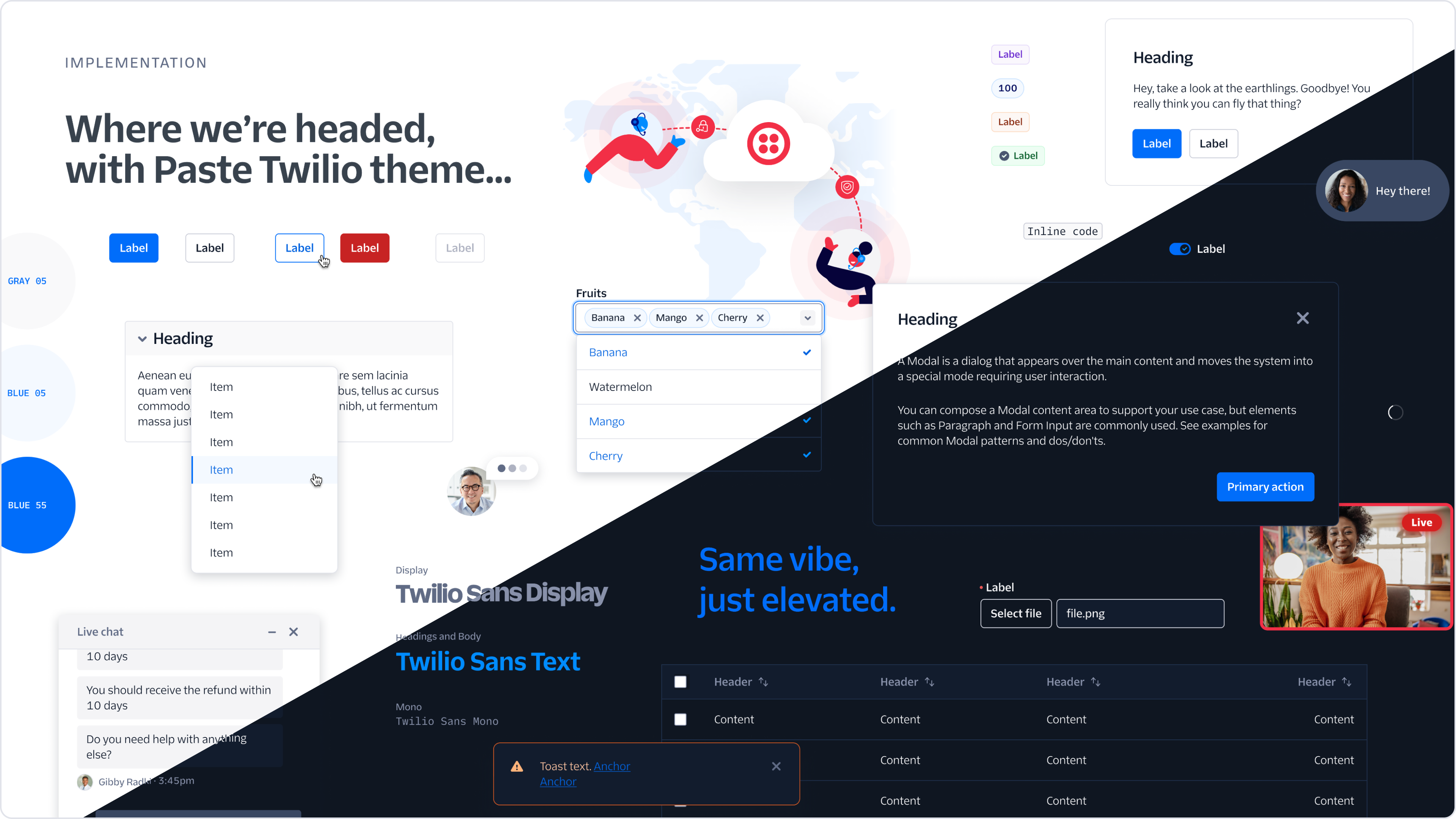
2023 marked the release of the One Twilio Design Language (Read about it on the Twilio Blog —a milestone in the unification across all of Twilio's platforms. This design language harmonizes visual elements and interactive components under a set of themes, namely twilio and twilio-dark, which are meticulously crafted to cater to a broad spectrum of interface applications and user preferences. The Evergreen theme was released to aid Segment's migration to the Twilio Design Language, by providing an evolutionary architecture tool to incrementally replace Evergreen without stopping feature development or customer impact.
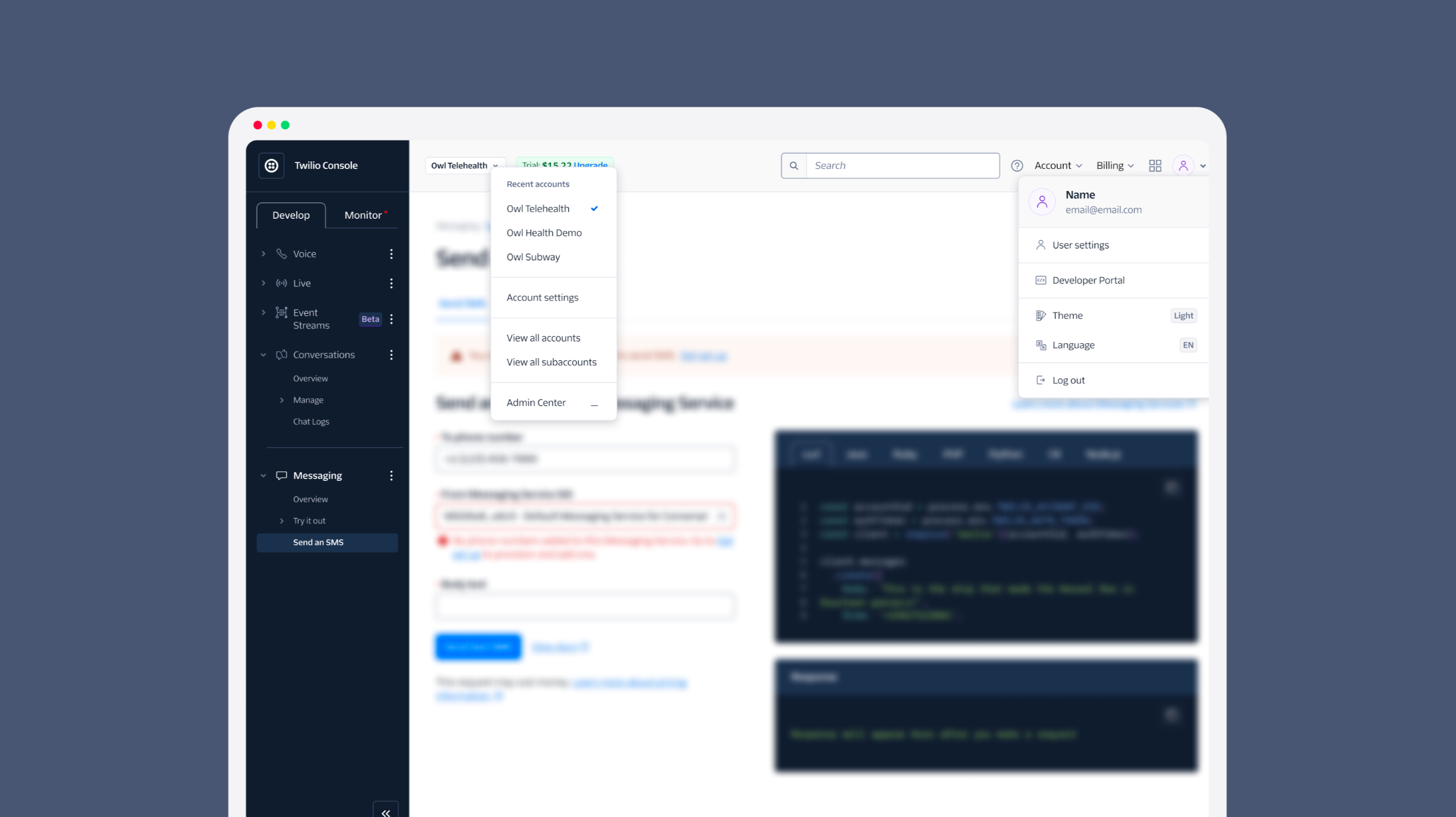
The Navigation UI Kit, introduced in August, solidified our commitment to a unified user interface. By providing the building blocks to support every application's navigation needs, we created a cohesive and familiar navigation experience as customers as they switch between Twilio products. The new components that were created as part of the Navigation UI Kit are:
- Topbar: Serves as a centralized access point for application controls, segmenting into User and Account controls.
- Sidebar: Functions primarily for application navigation, with flexible modes.
- Account Switcher: Standardizes transitions between accounts or related entities within any Twilio application.
- Product Switcher: Simplifies transitions between Twilio services.
- User Dialog: Offers convenient access to account-related settings and preferences.
- Status Badge and Status Menu: Provide visual indicators for processes or connection statuses.
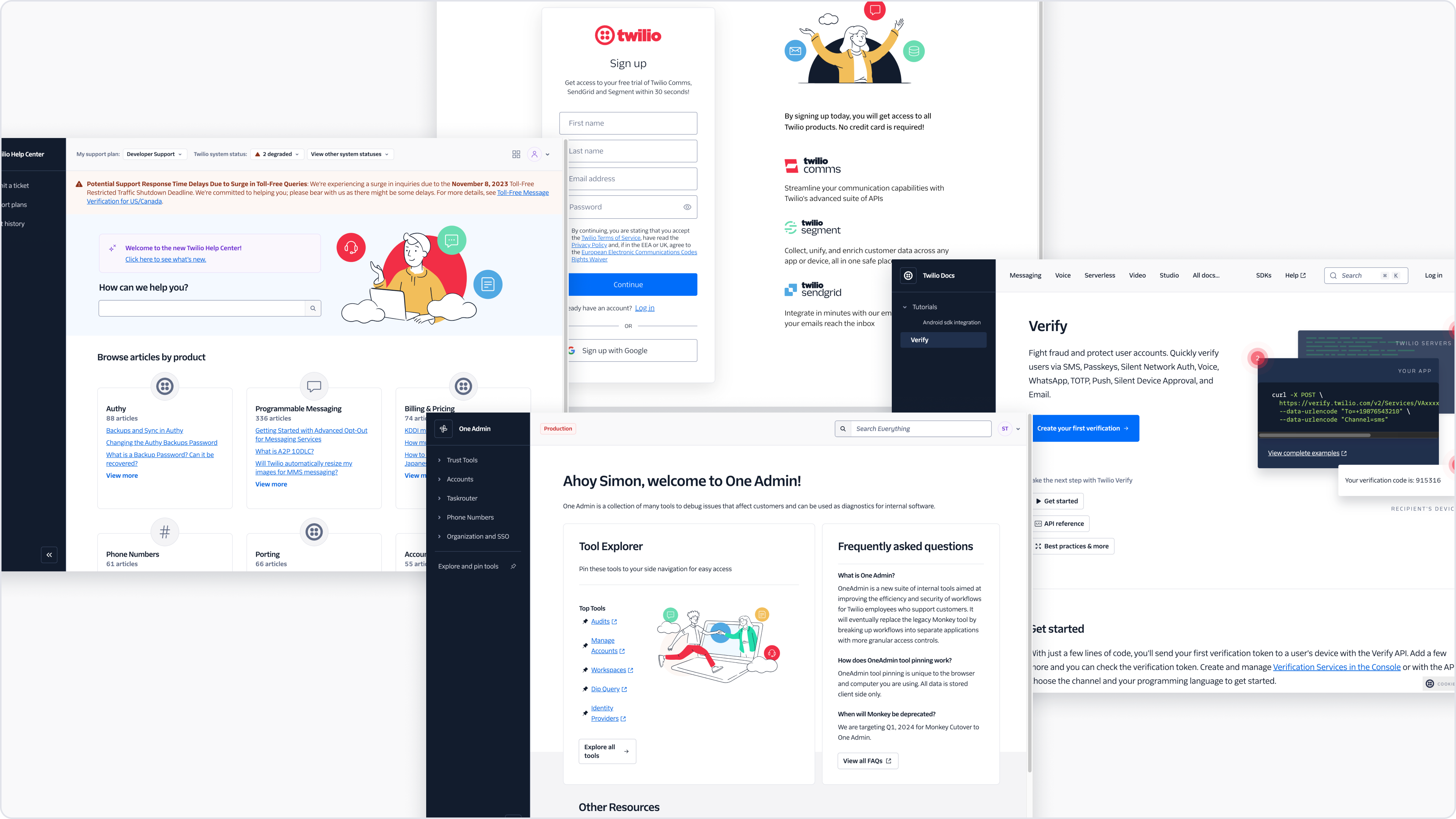
Since its release we're already seeing the new design language and navigation rollout to several customer touch points, across Universal Login, the new One Support Center, the new Twilio Docs Platform and new internal tools. We also saw the Product Switcher get implemented this year to provide super easy navigation between Twilio products.
💡 Did you know?
From 0% adoption 4 years ago, we now see that 80% of all Twilio Console page views are pages built entirely with Paste. Segment went from 0% to 48% Paste adoption in 9 months!
This makes it so easy to roll out our unified Design Language to the rest of Twilio customers in 2024. With such high adoption, we're so close!
In addition to those two large projects, the team managed to ship:
| Components | Primitives | Icons | Patterns | Templates | Foundations |
|---|---|---|---|---|---|
| 18 | 1 | 75 | 2 | 4 | 2 |
We continue to see exceptional adoption of components to build out Twilio UIs across the business, here's a highlight of what we're seeing (numbers represent each time a react component is used):
| Console | Internal tools | Segment App | Sendgrid App | Overall Total |
|---|---|---|---|---|
| ~55,314 | ~13,955 | 12,966 | 2,137 | ~85,469 |
Typography Guidelines

The Typography Guidelines set specific parameters for the use of the new typefaces—Twilio Sans Display, Twilio Sans Text, and Twilio Sans Mono—ensuring consistent readability and visual harmony across Twilio's product landscapes.
Page Spacing and Layout Guidelines
Launched in January, these guidelines provide foundational advice on creating visual relationships between page elements, thus aiding product builders to craft intuitive and visually coherent interfaces.
Form Component
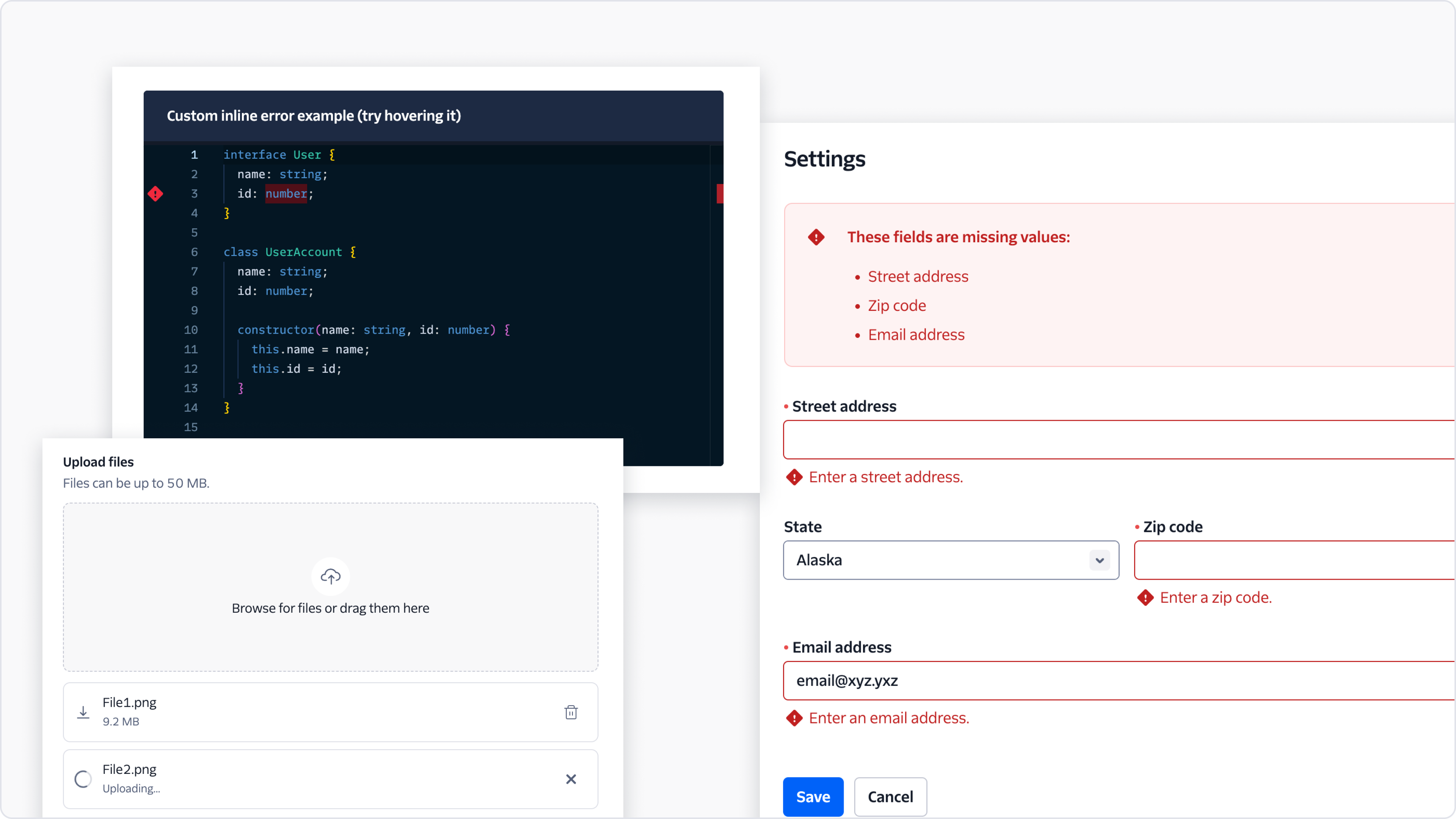
The Form component standardizes form interfaces across different pages, making usability and user interaction uniform and intuitive.
File Uploader
Addressing the frequent need for file attachments, the File Uploader is made easily accessible and user-friendly with drag-and-drop functionalities.
Editable Code Block Component
The Editable Code Block Component, based on the Paste Code Editor library, allows for essential code-editing functionalities within web applications.
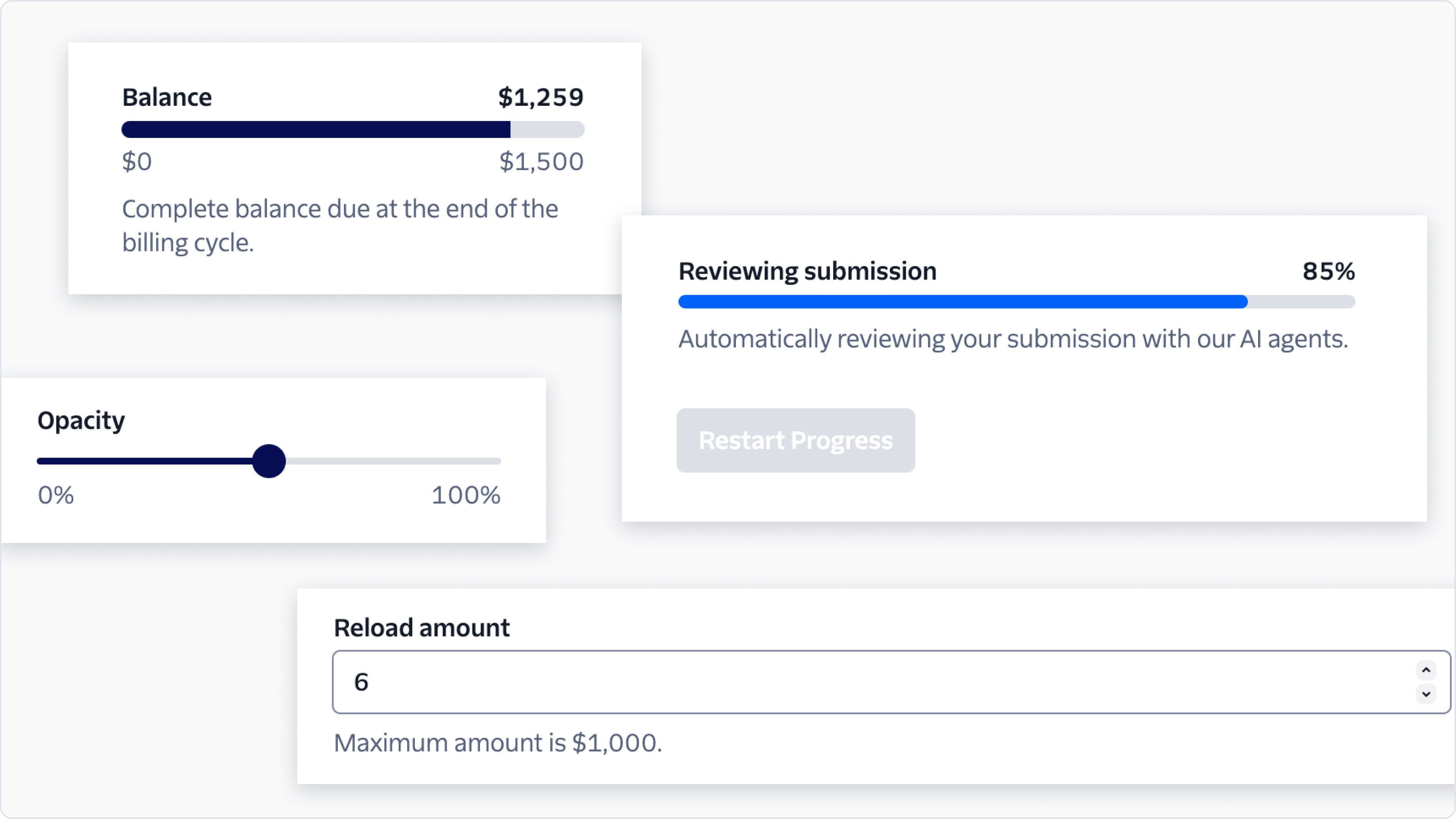
Four new components emerged to depict numerical data effectively:
- The Slider allows for precise control over a range of values.
- The Number Input provides a dedicated interface for numerical entry.
- The Progress Bar visualizes progress through processes.
- The Meter is used where capacity or quantity needs to be displayed in a range.
Description List Component
The Description List Component was designed to present information methodically, managing dense text effectively to extract pertinent details without the clutter.
Detail Text Component
April saw the introduction of the Detail Text Component intended for subtly accompanying main content without overpowering it.
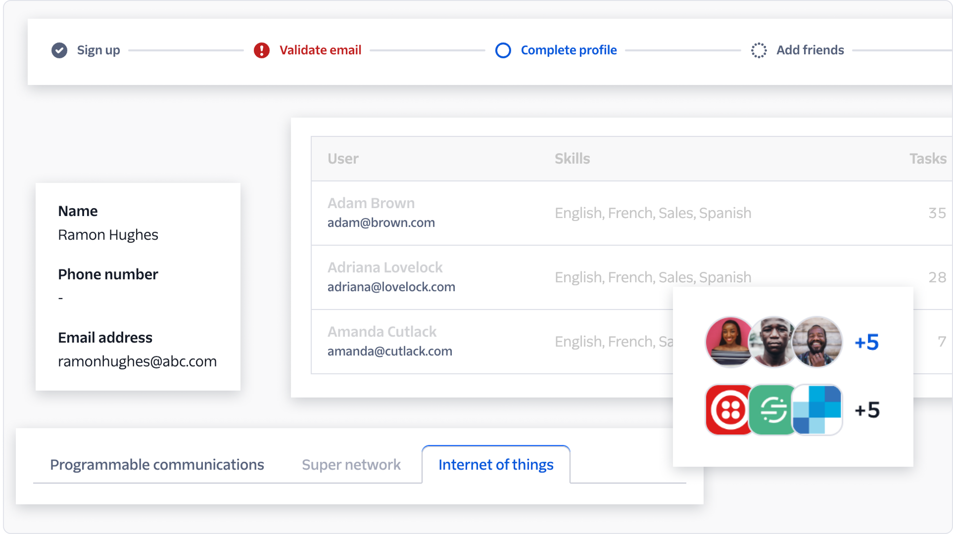
Progress Steps Component
The Progress Steps Component, which debuted in August, addresses the challenge of guiding users through multi-step tasks or sessions with a visual tracking system.
Refreshed Avatar Component and New Avatar Group
A significant refresh was done for the Avatar component to permit the display of groups. This functionality is vital for Twilio products that handle entity or human group representations.
Redesigned Tabs Component
To delineate tabs from in-page navigation more distinctly, the Tabs component was redesigned to reflect its functionality more clearly.
Launch of Page Templates
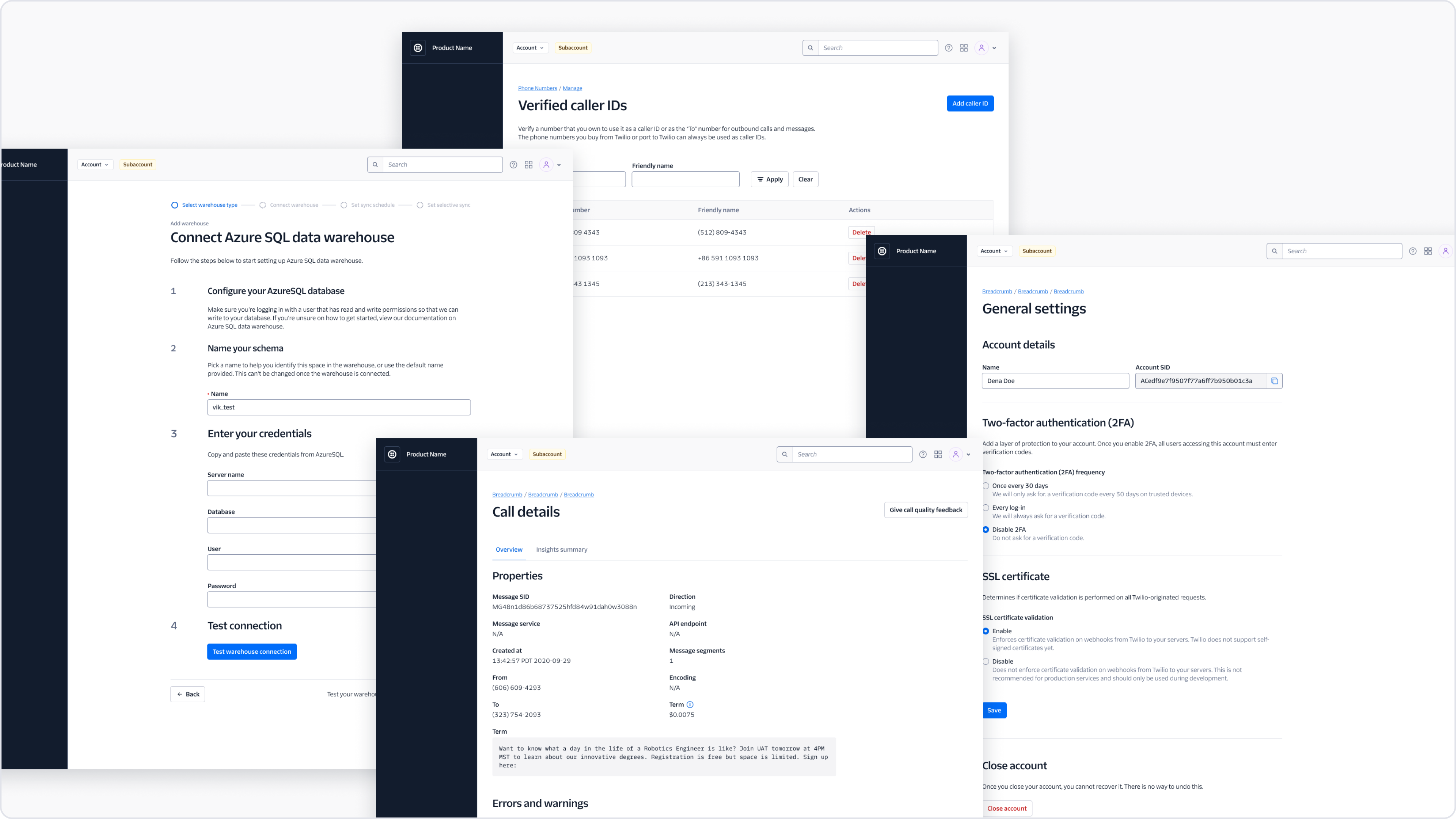
November saw the launch of a series of page templates. These include settings for various page types ranging from object details to wizards. These templates offer flexible layout choices to cater to product and platform-agnostic needs.
Error Messaging Content Guidelines
Through Megan Allison's contribution, the Error State pattern documentation was formulated, presenting a structured approach for creating precise error messages.
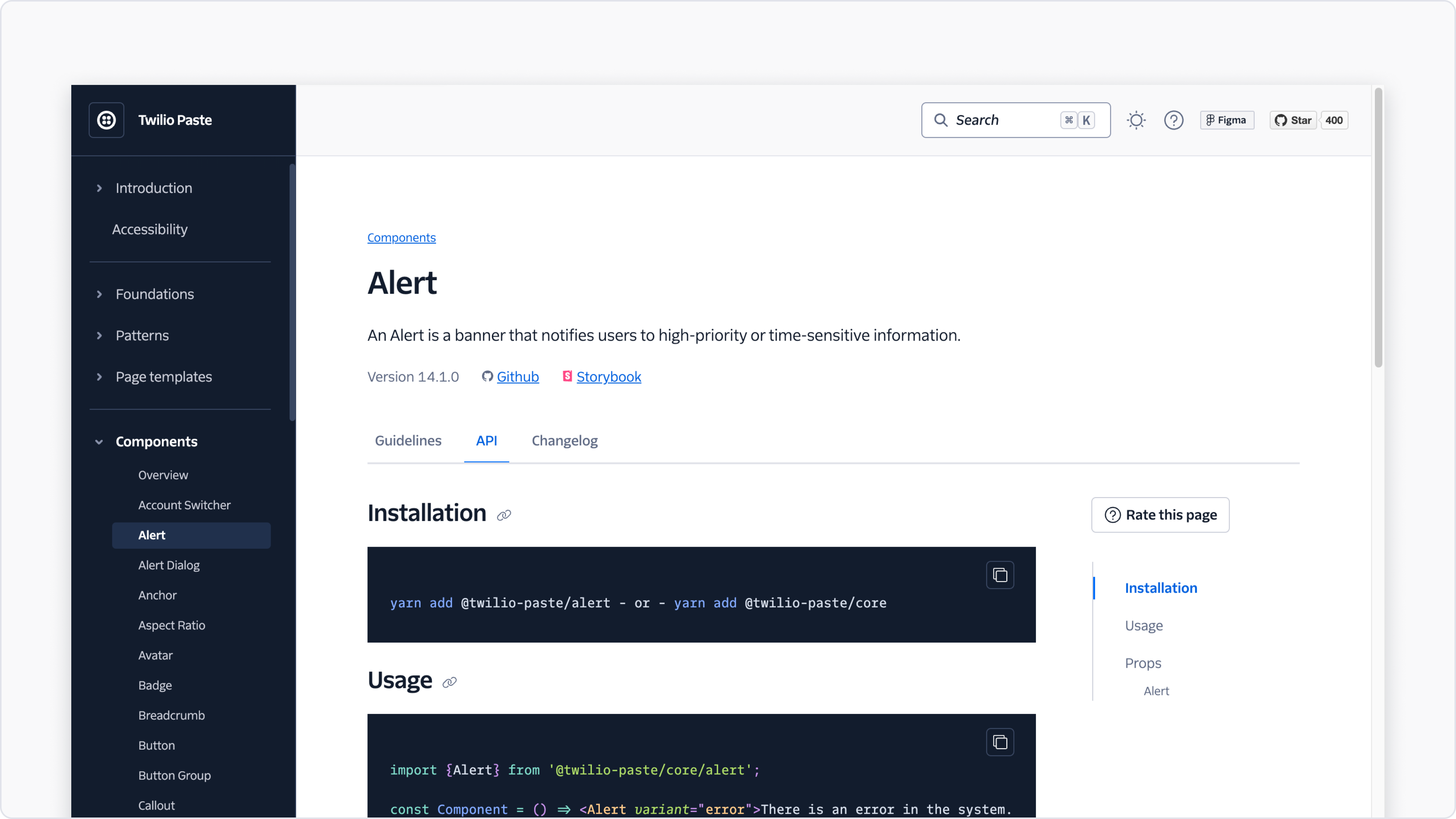
Component documentation underwent a transformation:
- Guidelines Page: Offers comprehensive usage instructions.
- API Page: Provides detailed technical properties, all now automated to ensure accuracy.
- Changelog Page: Keeps a record of component updates and changes.
Confirmation Pattern
An addition from Megan Allison, the Confirmation Pattern aids in presenting complex or consequential actions to users in a clear manner.
By automating monorepo dependency management and ensuring full support for React 18, we've secured a robust foundation for Paste going forward.
Efforts to reduce average Continuous Integration runtime paid off, reducing some long running task by 75%.
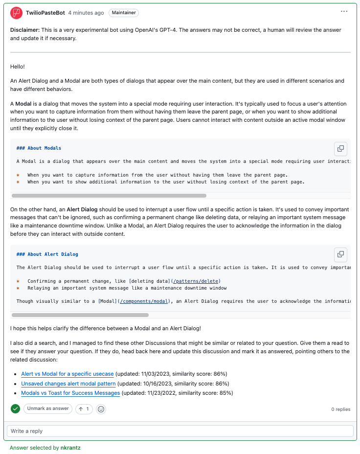
We started experimenting with AI 2023, employing a ChatGPT powered Github Discussion answering bot that uses our documentation to try and provide a speedy answer to common, and known questions.
As we kick off 2024, the Paste team is proud to highlight our comprehensive array of components, templates, and guidelines that were shipped in 2023. These latest achievements demonstrate our steadfast commitment to delivering exceptional experiences for developers and users alike. From boldly integrating AI with PasteBot to meticulously refining and updating key design elements, we've not only adapted to the evolving landscape – we've actively shaped it. In our pursuit of excellence, we continue to hone the tools and resources that empower creators and problem-solvers, fostering a dynamic ecosystem of innovation and collaboration. As we look ahead, we do so with renewed vigor and excitement for the next chapter in our journey.