Paste Design System Newsletter - August 2023 Edition

📣 Everything in the Navigation UI Kit
The Navigation UI kit structures common elements found in Twilio products to provide customers a cohesive, expected way to find what they're looking for. Applying this pattern across all our experiences also makes the Twilio product suite feel and behave like one family of products.
The Navigation UI Kit is composed of a collection of ingredients that can be combined in different ways to create navigation structure for a variety of applications.
Topbar
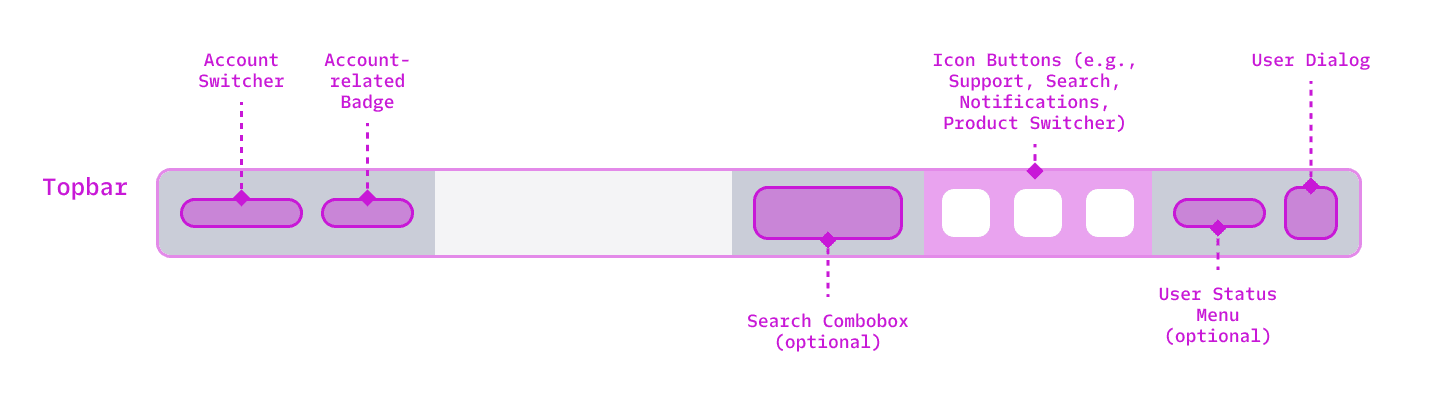
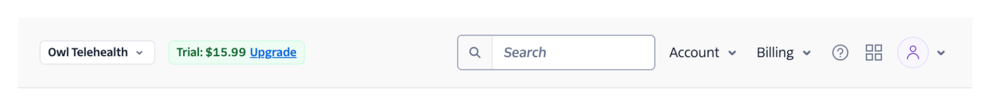
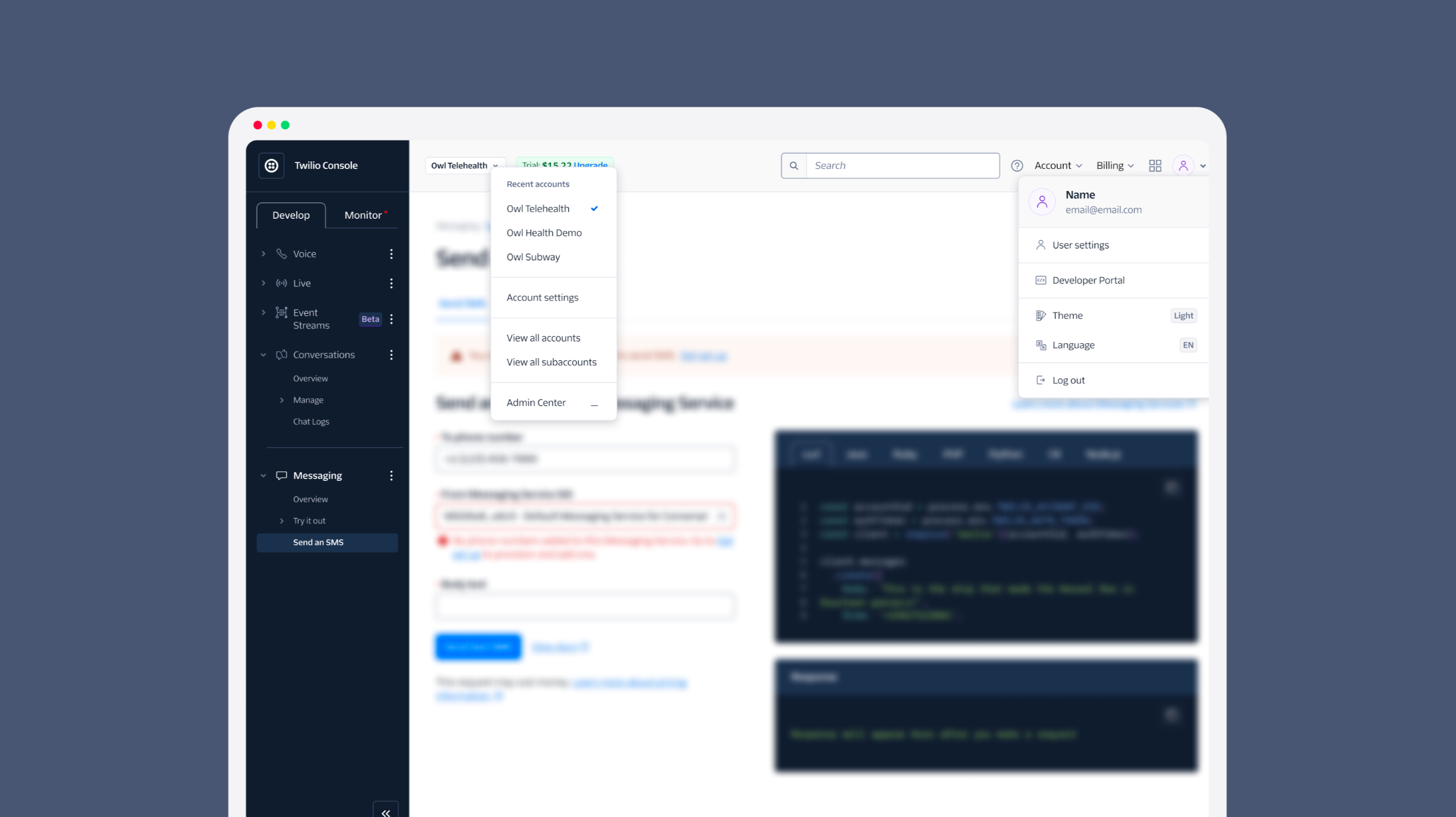
Our Topbar is fixed at the top of your app window for easy access to key application controls. It conveniently categorizes controls into two sections: User and Account. To keep things organized, we recommend separating these controls; user controls on the right and account controls on the left.
Account control examples include:
- Account Switcher
- Online Status controls
- Account type indicators, such as subaccount Badges
- Possible upgrade actions
Here are some user control possibilities:
- Search function using Input or Combobox
- Support Menu
- Product Switcher
- User Dialog
Sidebar
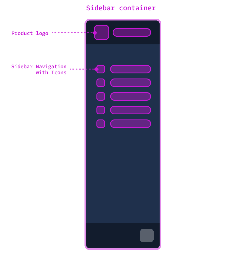
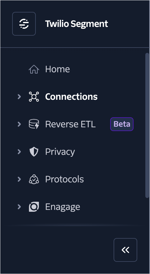
The Sidebar forms the heart of primary navigation within any application. It caters to both flat and hierarchical structures, thereby meeting the diverse needs of different Twilio applications. Its consistent design ensures a familiar way to navigate back to an applications home dashboard across all Twilio products. With two collapsible modes—"push" and "overlay"—it intends to cater to the needs of distinct, and different user personas based on their screen real estate needs.
Account Switcher
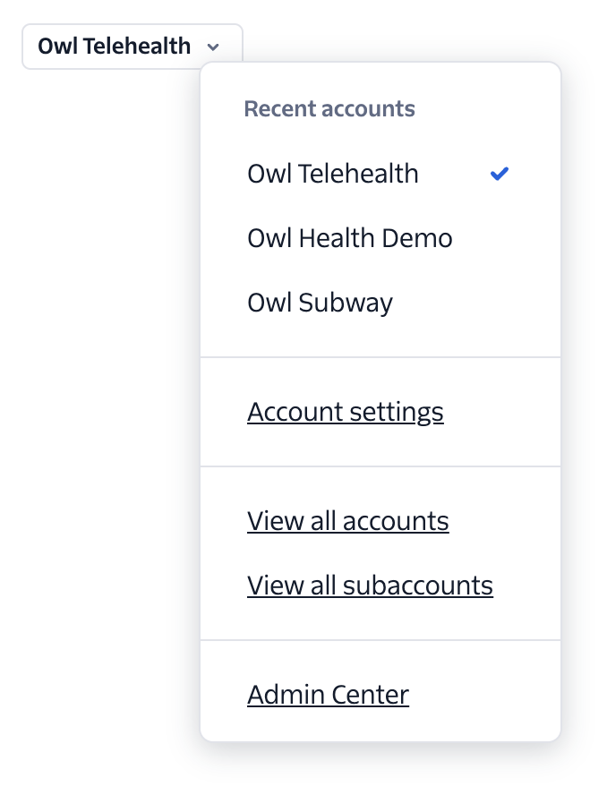
An essential part of any Twilio application is the ability to switch between Accounts, Sub-accounts, Workspaces or Projects. The Account Switcher offers a uniform method of changing accounts across all applications, fostering familiarity even as users switch between distinct products.
Product Switcher
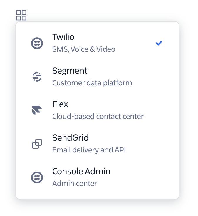
Transitioning between different products or applications is another key feature required by our customers as they weave their engagement solutions together with Twilio's multitude of capabilities and APIs. The Product Switcher ensures a consistent and intuitive means for navigating through purchased Twilio services and can be located conveniently in the Topbar.
User Dialog
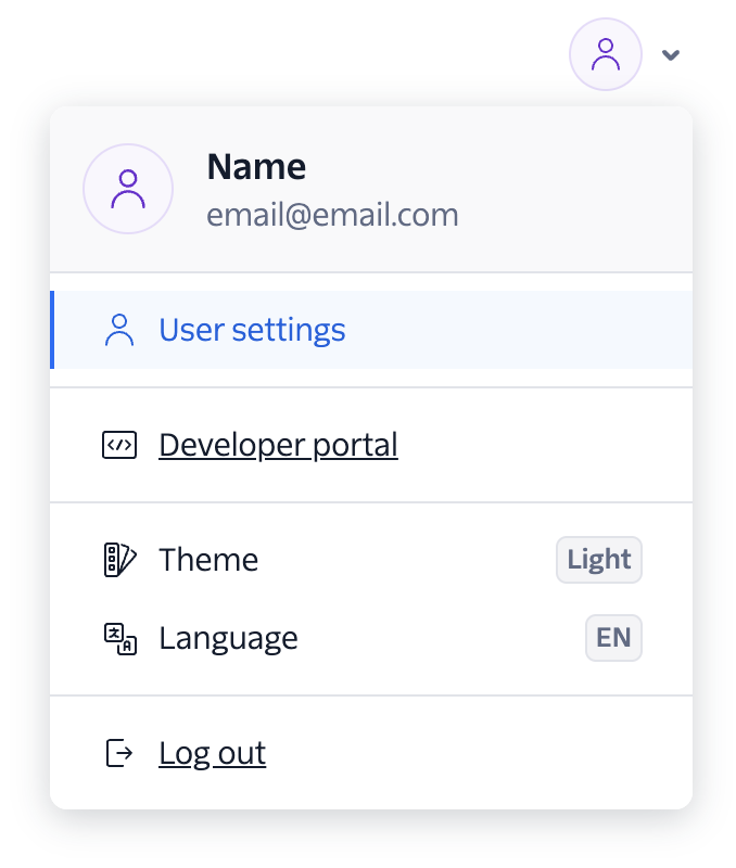
Providing a common way for a user to control or edit their account, settings or preferences is the job of the User Dialog. Designed to be housed in the Topbar, the User Dialog provides you with a way to display user data such as an Avatar, email address and name, along with actions that user might wish to take. Actions might include editing user settings, visiting documentation, switching between light and dark modes, or languages and logging out.
Status Badge
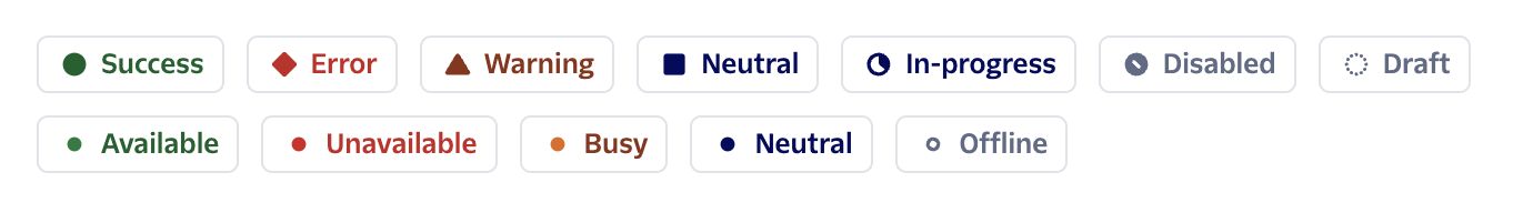
The Status Badge further evolves from our Object Status Pattern, allowing you to communicate status updates for any process or connection seamlessly. It provides an implementation of the Status Pattern using an appropriate combination of status level indicators, icons and colors.
Status Menu
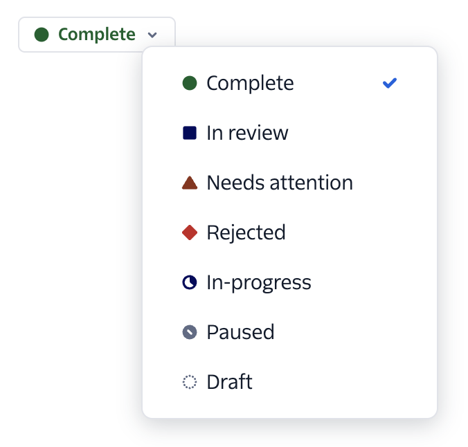
For processes that require frequent changes in status, we've married together the Menu with the Status Badge. The resulting Status Menu allows quick understanding and modification of ongoing statuses.
Progress Steps

One of our highest requested components lands into production! Catering especially to product areas featuring multi-step flows—the Progress Steps component aims at delivering a smooth sequence towards completion.
It visually breaks down complex tasks into manageable chunks—ideal for 3–5 steps—and indicates both completed and remaining steps. Use these Progress Steps when tasks are nonlinear or require multiple sessions for completion.
- Selectable menu items
- Menu badge
- Added Rich Text Editor Icons
- Updated the Paste Patterns library in Figma to "Paste Patterns & Layouts", which now uses the new twilio theme.
- Resolved issues where slot styles would override swapped components.
| Feature | Description |
|---|---|
| Visual Picker component | Visual Picker is a visually enhanced checkbox or radio button selection element. |
| Slider component | Draggable input over a range of numbers. |
| Editable Code block component | A component used to create editable, syntax highlighted blocks of code. |
| Empty state pattern updates | Improved guidance on how to compose empty states within product UI. |
| Meter component | Communicates the capacity of an object within a range, especially when there's no user need to completely fill the range. |
| Progress Bar component | Communicates progress through a linear process, especially when there's a need to finish the process. |
| Product page layouts | Figma templates for common Twilio page layouts, such as Manage List and Settings pages. |
| Variables for Paste Figma libraries | Adding variables to Paste Figma libraries to allow easier swapping between themes and light/dark modes. |
As always, we're better together.
— The UX Infrastructure Team